15 Teardrop Backsplash Ideas You’ll Want to Save Right Now
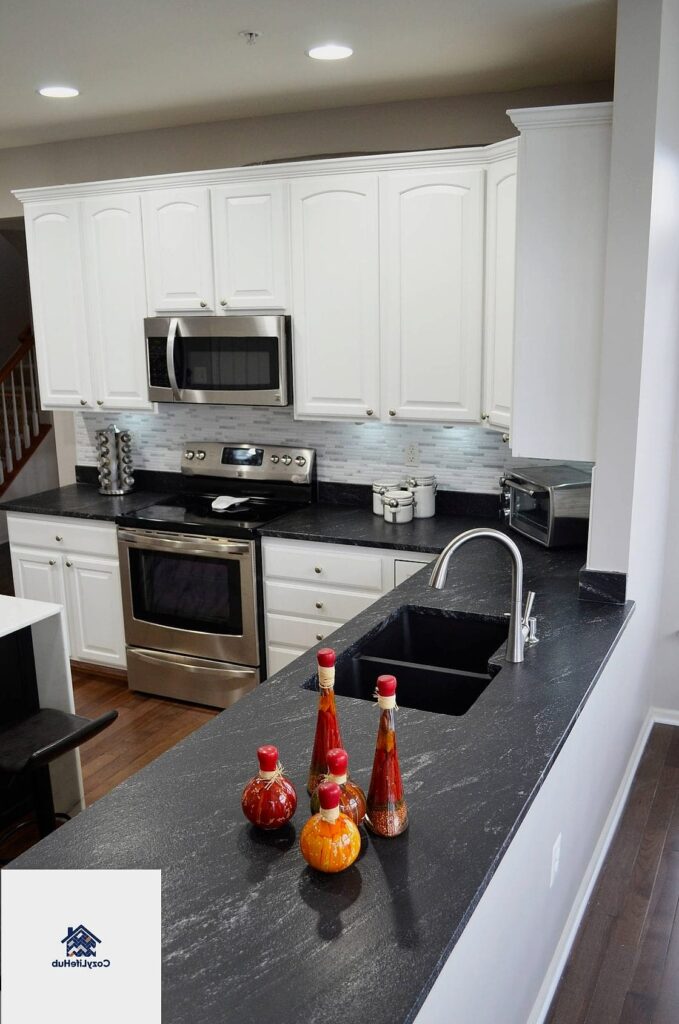
- Classic White Teardrop Tile in a Kitchen
- Teardrop Tile in Soft Sage Green
- Black Teardrop Tile for Drama
- Teardrop Mosaic in a Powder Room
- Layered Teardrop Pattern with Two Tones
- Teardrop Tile Paired with Butcher Block Counters
- Full-Wall Teardrop Backsplash
- Teardrop Tile with Herringbone Border
- Budget-Friendly Peel-and-Stick Teardrop Tile
- Teardrop Tile in a Warm Terracotta Shade
- Vertical Teardrop Installation
- Teardrop Tile Behind Open Shelving
- Teardrop Tile with Contrasting Dark Grout
- Small-Format Teardrop Tile for a Cottage Kitchen
- Two-Tone Checkerboard-Inspired Teardrop Layout
15 Teardrop Backsplash Ideas You’ll Want to Save Right Now
Teardrop backsplashes are having a real moment right now, and honestly, it’s easy to see why. That gentle curved shape softens up a kitchen in a way that straight edges just can’t. If you’ve been scrolling through renovation photos wondering what that wavy, almost scalloped-looking tile pattern is called, you’ve found your answer. Below are fifteen ways to bring this look into your own space, whether you’re planning a full remodel or just want to swap out your existing tile for something with more personality.
Classic White Teardrop Tile in a Kitchen
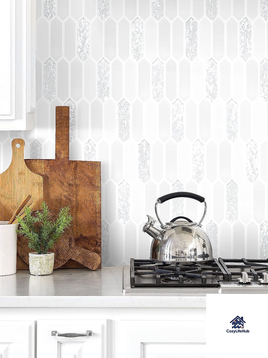
This is the starting point for most homeowners, and for good reason. White teardrop tile keeps things bright and timeless while still giving you that soft, curved silhouette that flat subway tile lacks. It works especially well in kitchens with white or light gray cabinetry, since the backsplash becomes a subtle texture moment rather than a bold statement. Pair it with a matte white grout for a seamless look, or go with a soft gray grout if you want the shape to stand out a little more. This option is pretty forgiving for DIYers too, since the tiles are usually sold on mesh sheets that make installation more manageable.
Teardrop Tile in Soft Sage Green
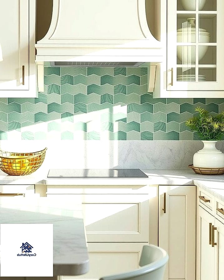
Sage green has been everywhere in kitchen design lately, and teardrop tile happens to be a great vehicle for it. The curved shape catches light differently than flat tile, so the color reads a little richer and more dimensional on the wall. This works beautifully in farmhouse kitchens or anywhere you’re leaning into warm wood tones and natural materials. Try pairing it with brushed brass hardware for a combination that feels collected rather than trendy. Keep in mind that colored grout can shift the whole vibe, so test a sample before committing.
Black Teardrop Tile for Drama
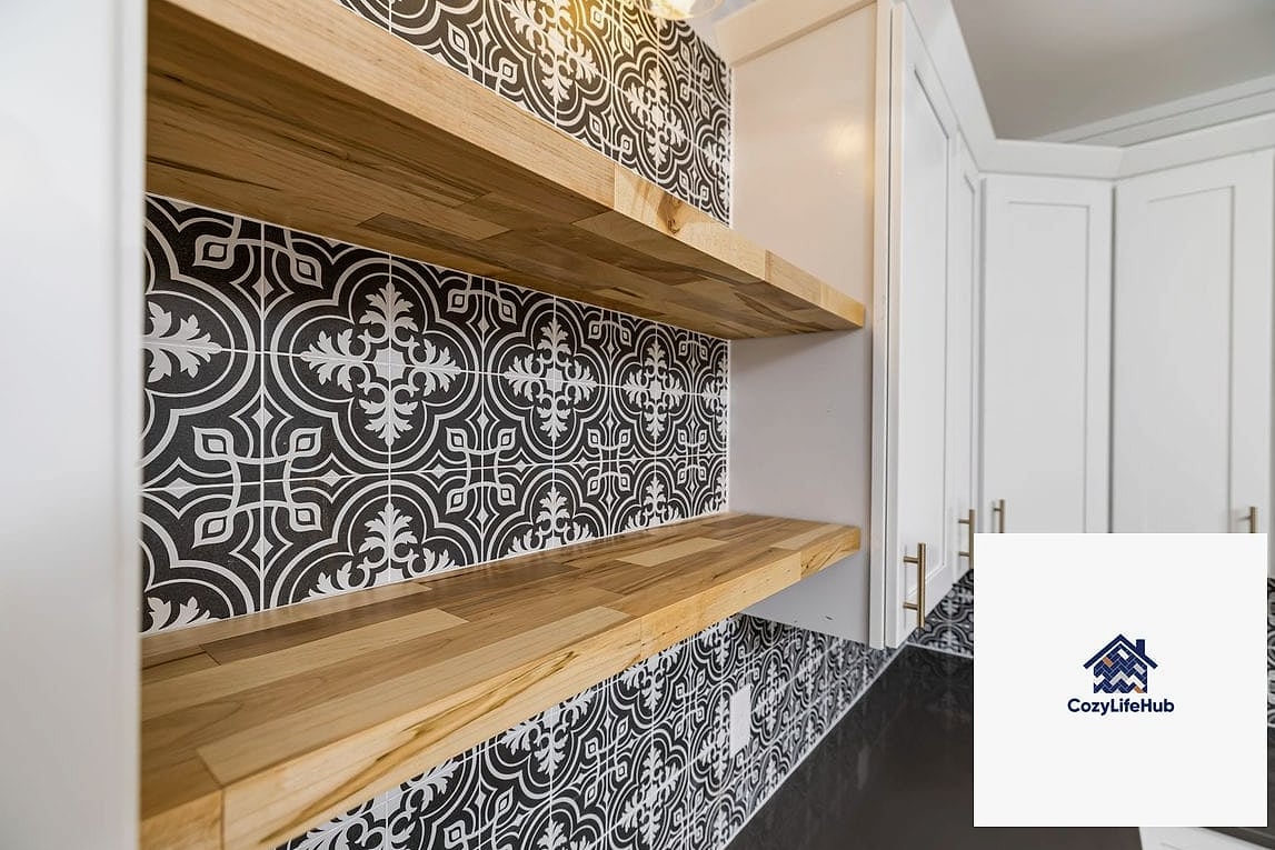
If your kitchen already has a lot of light surfaces, a black teardrop backsplash can be the contrast piece that pulls everything together. This is a bolder choice, and it tends to work best in kitchens with black fixtures, dark hardware, or at least one other dark element to echo it. The curved shape actually helps keep black tile from feeling too heavy, since the movement in the pattern breaks up what would otherwise be a flat, solid block of color. Glossy black tile reflects light nicely in smaller kitchens, while matte black feels more grounded and moody.
Teardrop Mosaic in a Powder Room
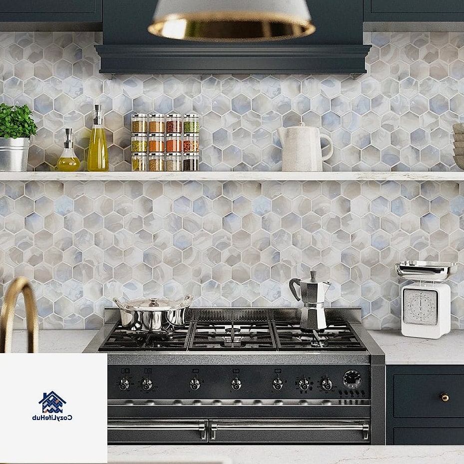
Backsplash ideas aren’t just for kitchens, and this one proves it. A small teardrop mosaic on a powder room accent wall or behind a floating vanity adds texture without overwhelming a tight space. Because powder rooms are low-traffic, you can get away with a more delicate or intricate teardrop pattern that might feel like too much in a busy kitchen. This is also a great spot to experiment with color if you’re nervous about committing to something bold in a larger room.
Layered Teardrop Pattern with Two Tones
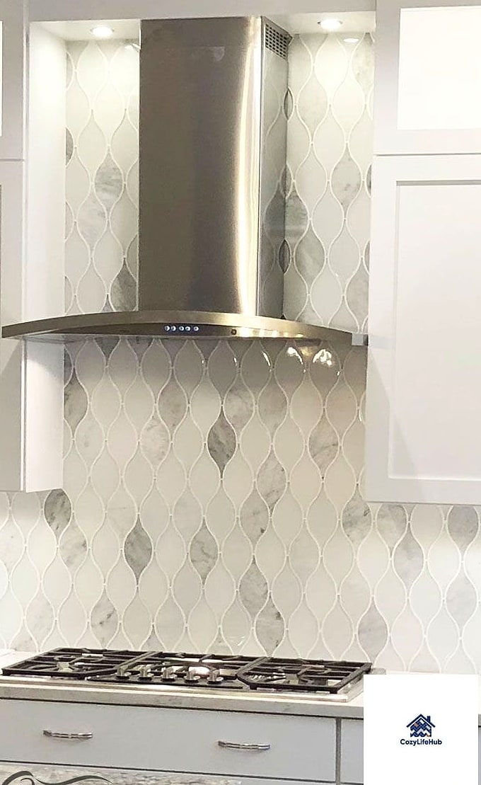
Instead of sticking with one color, some homeowners are mixing two shades of teardrop tile in a layered or ombre-style arrangement. Picture a gradient that moves from a deeper color near the countertop up to a lighter shade near the upper cabinets. It’s a subtle effect, but it adds a surprising amount of depth to an otherwise simple kitchen. This works particularly well behind a stove or range as a focal point, since that’s usually the area guests’ eyes land on first.
Teardrop Tile Paired with Butcher Block Counters
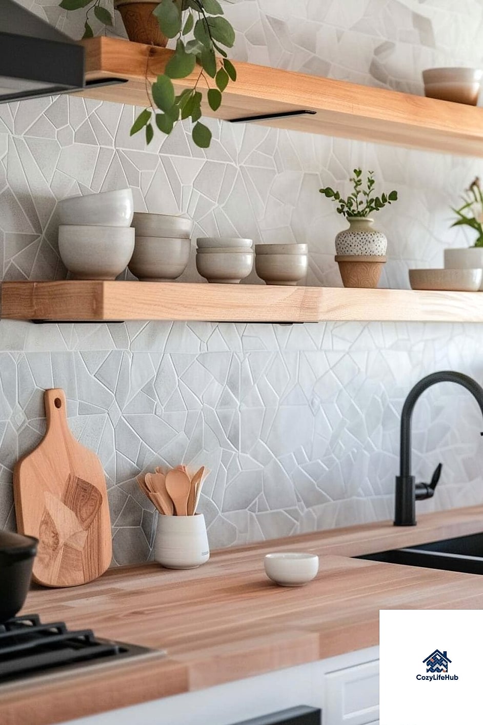
There’s something about the organic curve of teardrop tile that pairs naturally with butcher block counters. Both bring warmth and a slightly handmade feel into the kitchen, which is a nice departure from the sharp lines of quartz and stainless steel. A cream or warm white teardrop tile against butcher block reads cozy and inviting, almost cottage-like. This combination tends to be popular in smaller kitchens where you want everything to feel soft and lived-in rather than showroom-perfect.
Full-Wall Teardrop Backsplash
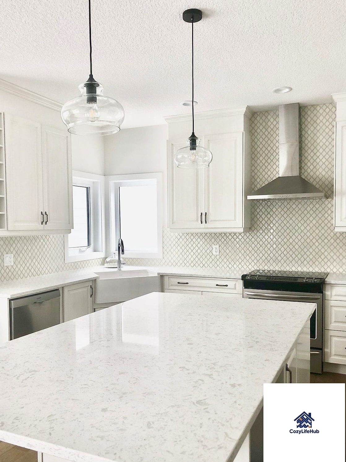
Most kitchens stick to a standard backsplash height, but going full wall with teardrop tile creates a much bigger visual impact. This is a great option if you have open shelving instead of upper cabinets, since it gives the tile room to actually be seen. It’s more of an investment, both in materials and installation time, but the payoff is a kitchen that looks custom-designed rather than builder-grade. If budget is a concern, consider doing the full wall on just one focal area, like behind the range, and a standard height everywhere else.
Teardrop Tile with Herringbone Border
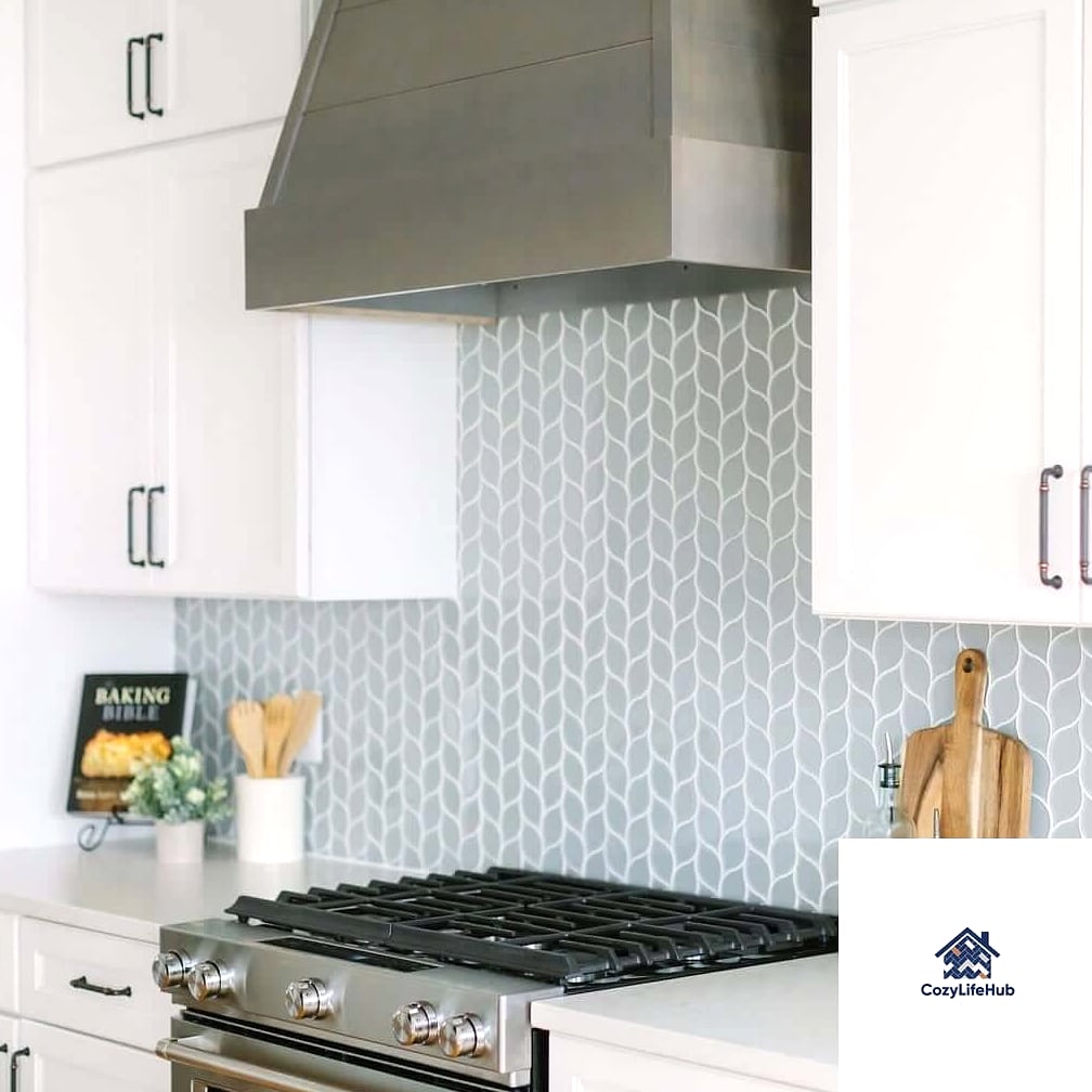
Combining teardrop tile with a herringbone pattern border might sound like a lot, but when it’s done well, it looks intentional and layered rather than busy. Use the teardrop shape as your main field and frame it with a thin herringbone strip along the top or edges. This is a more advanced installation, so it’s probably not the best pick for a first DIY project, but a tile installer can usually pull it off without too much trouble. The result is a backsplash that feels like it came from a custom design magazine.
Budget-Friendly Peel-and-Stick Teardrop Tile
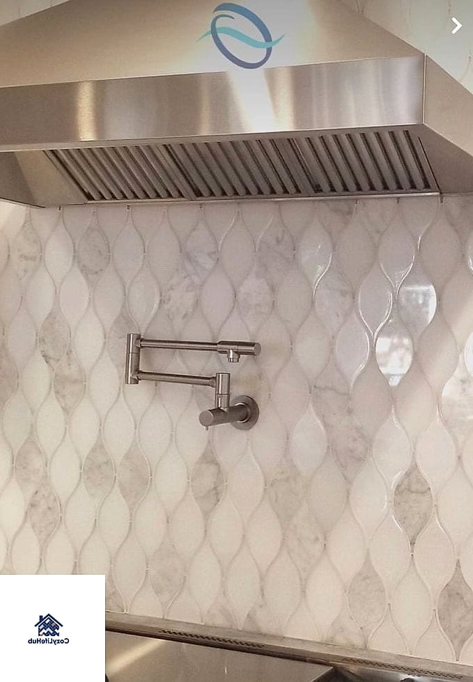
Not everyone is ready for a full tile installation, and that’s completely fine. Peel-and-stick teardrop tile has gotten a lot better in recent years, and it’s a solid option for renters or anyone testing out the look before committing. These come in a surprising range of colors and finishes now, including some that mimic ceramic or natural stone pretty convincingly. Just make sure your wall surface is clean and smooth before applying, since bumps and texture will show through. It’s also worth noting that peel-and-stick isn’t ideal directly behind a stove where heat exposure is high.
Teardrop Tile in a Warm Terracotta Shade
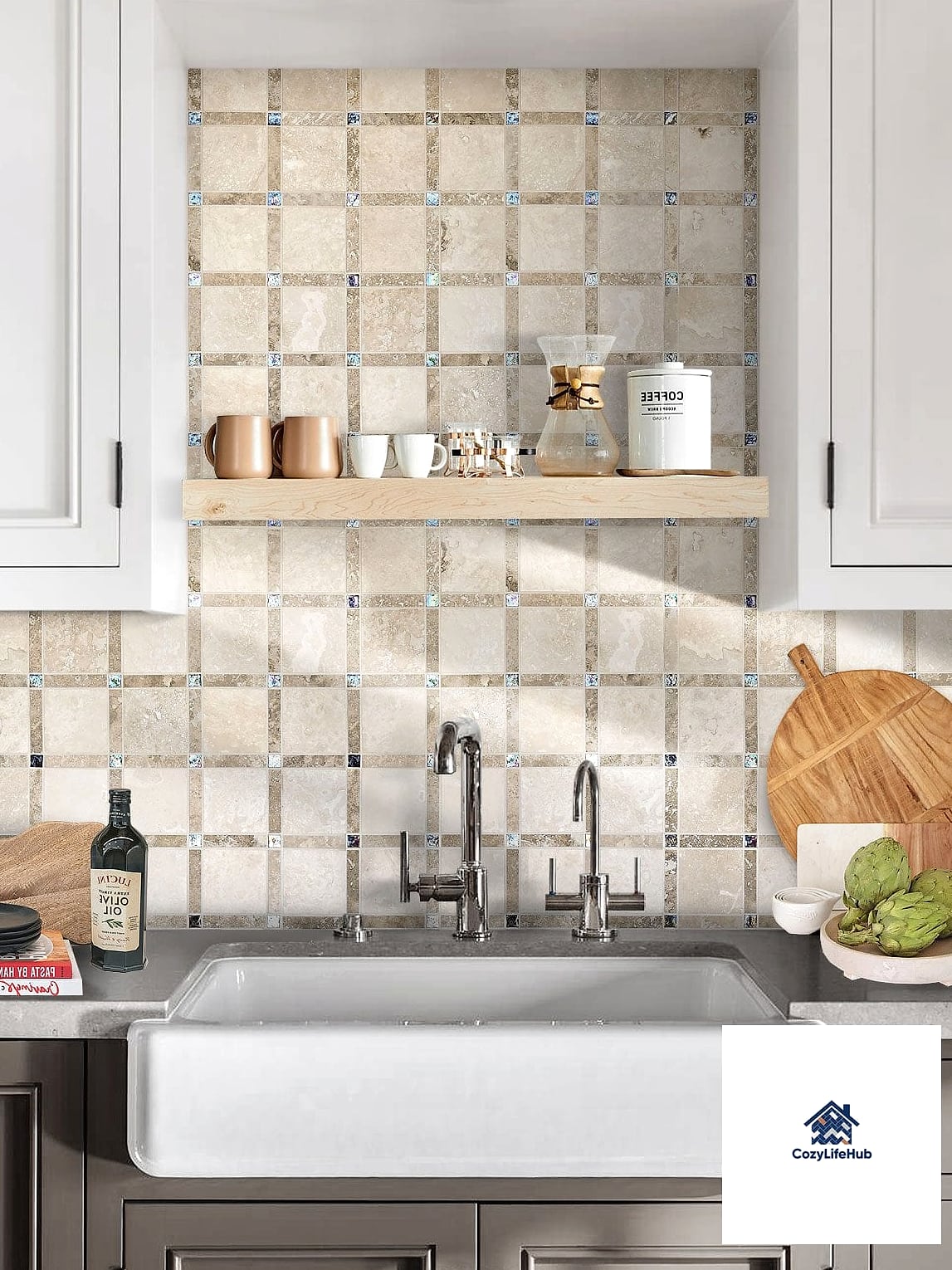
Terracotta and other warm clay tones bring a Mediterranean or Southwestern feel into a kitchen, and the teardrop shape only adds to that handcrafted look. This works especially well in kitchens with warm wood cabinetry or natural stone counters. It’s a color that photographs beautifully in natural light, so if your kitchen gets good sun exposure, this might be worth considering. Pair it with black or matte bronze hardware to keep the overall palette feeling cohesive rather than scattered.
Vertical Teardrop Installation
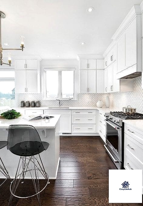
Most backsplash tile gets installed horizontally, but flipping the teardrop pattern vertically changes the whole feel of the space. It draws the eye upward, which can make a kitchen with low ceilings feel a little taller. This installation style tends to look best in a fairly minimal kitchen where the tile pattern itself is the main design feature. If you’re working with a tile installer, ask to see a mockup first, since vertical patterns can shift how much tile you actually need compared to a standard layout.
Teardrop Tile Behind Open Shelving
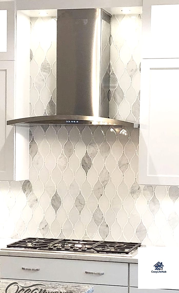
Open shelving has stuck around as a kitchen trend, and it happens to be a great showcase for a textured backsplash like teardrop tile. Since the shelves themselves are usually holding dishes, glassware, or a few plants, the tile behind them gets to be the quiet backdrop that ties the whole wall together. A soft neutral teardrop tile works well here so it doesn’t compete with whatever you’re displaying. This is also a practical pairing, since open shelving areas tend to see less splatter and mess than the zone right behind a stove.
Teardrop Tile with Contrasting Dark Grout
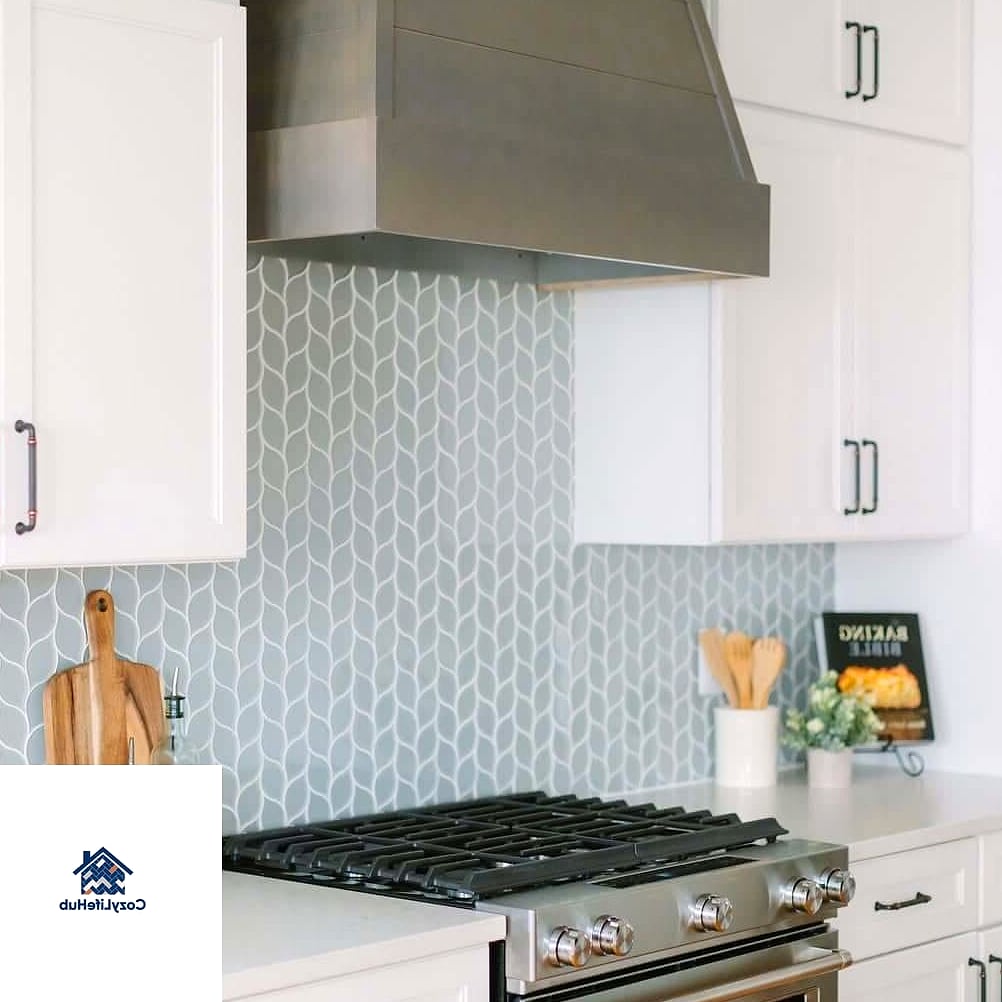
Sometimes the grout color does more work than the tile itself. White teardrop tile with charcoal or black grout creates a graphic, almost illustrated look, since every curve of the pattern gets outlined. This is a good option if you want the shape of the tile to really read from across the room rather than blending into the wall. Keep in mind that dark grout can be trickier to keep looking fresh with white tile, since any grout haze left behind during installation will be more noticeable.
Small-Format Teardrop Tile for a Cottage Kitchen
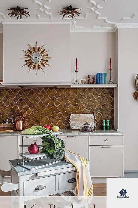
Scaling down to a smaller teardrop tile size gives you a more delicate, cottage-inspired look compared to larger format versions. This scale tends to suit smaller kitchens or older homes where a big bold pattern might feel out of place. Cream, soft blue, or pale pink shades all work nicely at this smaller scale, leaning into a slightly vintage feel without going full theme-park farmhouse. It’s a detail that a lot of guests won’t consciously notice, but they’ll feel that the kitchen has more character because of it.
Two-Tone Checkerboard-Inspired Teardrop Layout
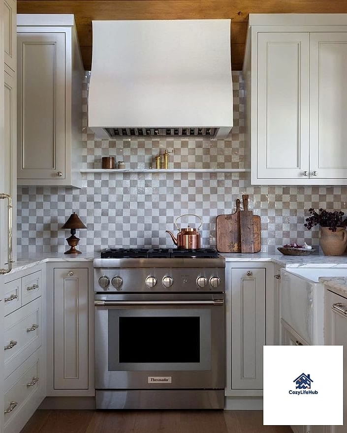
For homeowners who want something a little more playful, alternating two colors of teardrop tile in a loose checkerboard arrangement is worth trying. It’s less rigid than an actual checkerboard pattern because the curved edges soften the transitions between colors. This works well in a kitchen that already has some fun personality, like colorful cabinetry or vintage-inspired appliances. It’s a higher-commitment choice, so it’s worth living with tile samples on your wall for a few days before finalizing colors.
Whichever direction you go, teardrop backsplash tile is one of those details that quietly upgrades a kitchen without needing a full renovation to pull off. Save the ones that caught your eye, grab a few samples, and see how they actually look in your own lighting before you commit. Sometimes the best way to figure out what fits your space is just holding the tile up against your wall and living with it for a few days.