21 Trendy Colorful Herringbone Backsplash Ideas That Work in Any Size Home
- Sage Green Ceramic Herringbone
- Cobalt Blue Zellige Herringbone
- Terracotta Herringbone for Warm Kitchens
- Blush Pink Glossy Herringbone
- Deep Emerald Herringbone Accent Wall
- Mustard Yellow Herringbone for Retro Charm
- Burnt Orange Herringbone in a Small Galley Kitchen
- Two-Tone Blue and White Herringbone
- Coral Pink Herringbone for a Bold Bathroom
- Charcoal and Copper Herringbone
- Peel-and-Stick Turquoise Herringbone for Renters
- Rust Red Herringbone with Natural Wood Shelving
- Lavender Herringbone for a Soft, Feminine Kitchen
- Navy Blue Herringbone Behind a Range
- Ochre and Cream Herringbone Mix
- Deep Plum Herringbone for Drama
- Seafoam Green Herringbone for Coastal Kitchens
- Brick Red Herringbone with Black Grout
- Dusty Rose Herringbone for Small Bathrooms
- Olive Green Herringbone with Matte Black Fixtures
- Multi-Color Herringbone Mosaic
21 Trendy Colorful Herringbone Backsplash Ideas That Work in Any Size Home
Herringbone tile has that rare quality of looking expensive and intentional no matter what room it lands in. Add color into the mix, and suddenly a backsplash goes from “nice” to the actual focal point of the kitchen. If you’ve been scrolling for inspiration and feeling overwhelmed by the options, this list breaks down 21 colorful herringbone backsplash ideas that work whether you’ve got a sprawling chef’s kitchen or a galley kitchen the size of a closet.
The best part about herringbone is that the zigzag pattern itself does a lot of visual work. It draws the eye, adds movement, and makes small spaces feel less flat. Pair that with a punchy color, and you’ve got a design detail that people notice the second they walk in.
Sage Green Ceramic Herringbone
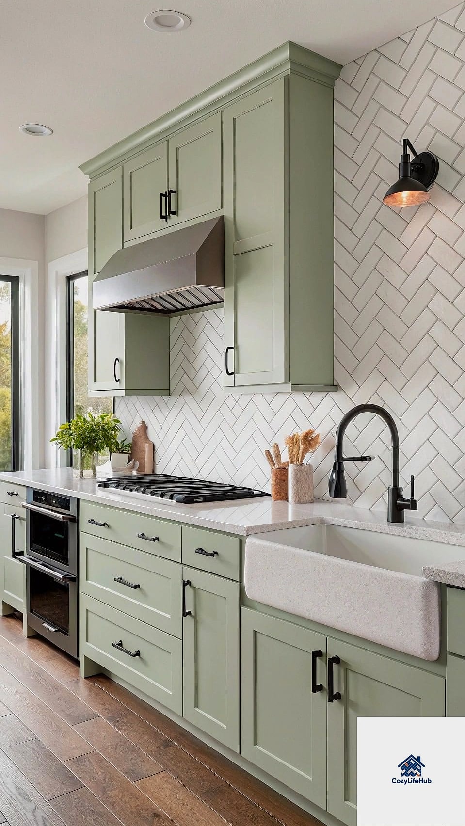
Sage green has stuck around as a favorite for a reason. It’s soft enough to feel calming but saturated enough to actually register as color, not just an off-white with a tint.
This works beautifully in farmhouse or cottage-style kitchens, especially paired with butcher block counters and brushed brass hardware. It’s forgiving too, since sage hides water spots better than stark white ever will.
For a DIY version, peel-and-stick herringbone sheets in sage are widely available and surprisingly convincing from a few feet away.
Cobalt Blue Zellige Herringbone
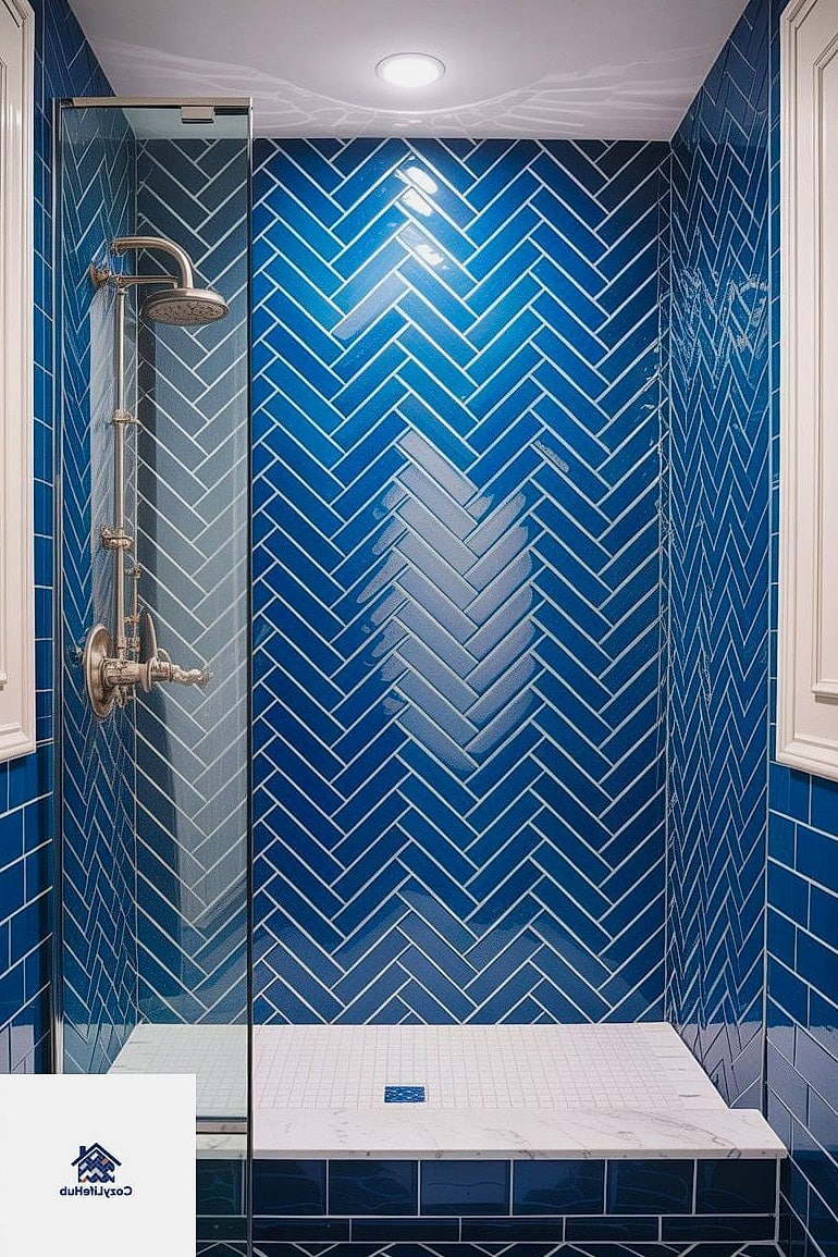
Zellige tile has that handmade, slightly imperfect look that makes every piece feel one of a kind. In cobalt blue, laid in herringbone, it becomes a genuine statement wall.
This is a splurge option, and it’s worth knowing zellige requires a bit more grout maintenance since it’s more porous than standard ceramic. But the depth of color you get in return is hard to replicate with anything mass-produced.
Best suited for kitchens with mostly white or natural wood cabinetry, so the blue has room to shine without competing for attention.
Terracotta Herringbone for Warm Kitchens
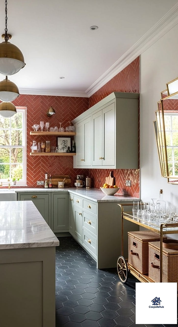
Terracotta has quietly become one of the most requested colors for kitchen updates, and herringbone is the layout that shows it off best. The warm, earthy tone pairs naturally with wood cabinets, black fixtures, and woven textures like rattan pendant lights.
It works especially well in kitchens that get a lot of natural light, since the color can read a little heavy in dim spaces. If your kitchen faces north, consider pairing it with lighter countertops to balance things out.
Porcelain versions of terracotta tile are durable, budget-friendly, and much easier to keep clean than actual clay tile.
Blush Pink Glossy Herringbone
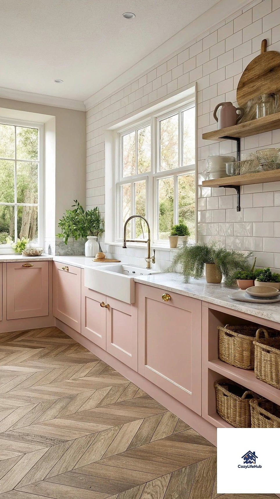
Pink backsplashes used to feel like a bold, maybe-too-trendy choice, but a soft blush in a glossy finish has proven it has staying power. The glossy surface bounces light around, which is a nice trick in a smaller kitchen without windows.
This pairs well with matte black fixtures for contrast, or with warm wood tones for something softer and more romantic. It’s also a favorite in bathrooms, not just kitchens, especially behind a vanity.
Glossy tile shows fingerprints and water spots more than matte, so keep a glass cleaner handy if you go this route.
Deep Emerald Herringbone Accent Wall
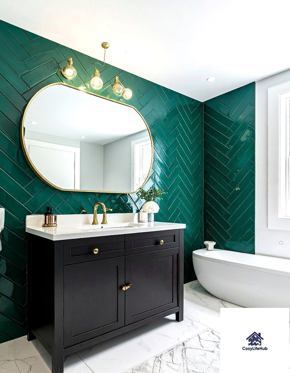
Emerald green feels rich and a little dramatic, which makes it perfect for a kitchen that wants to feel more like a lounge than a strictly functional space. Herringbone amplifies that richness because the pattern catches light differently across each tile.
This color pairs beautifully with gold or brass fixtures and dark wood cabinetry. It’s not a shy choice, so it works best as a full backsplash rather than just a small accent, otherwise it can look like an afterthought.
Ceramic subway-shaped tiles in emerald, laid herringbone, keep costs reasonable compared to natural stone alternatives.
Mustard Yellow Herringbone for Retro Charm
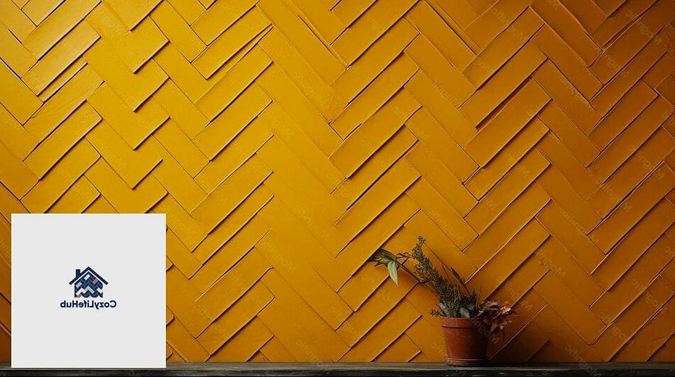
Mustard yellow brings a retro, almost midcentury feel into a kitchen without going full theme-park nostalgia. In herringbone, it reads more sophisticated than a plain yellow tile wall would.
This works particularly well in kitchens with white cabinets and black or white hex floor tile, giving the whole room a playful but still put-together look. It’s also a great choice for renters using peel-and-stick tile, since mustard is easy to remove and replace without much commitment anxiety.
Pair with open shelving and a few plants for a space that feels lived-in rather than staged.
Burnt Orange Herringbone in a Small Galley Kitchen
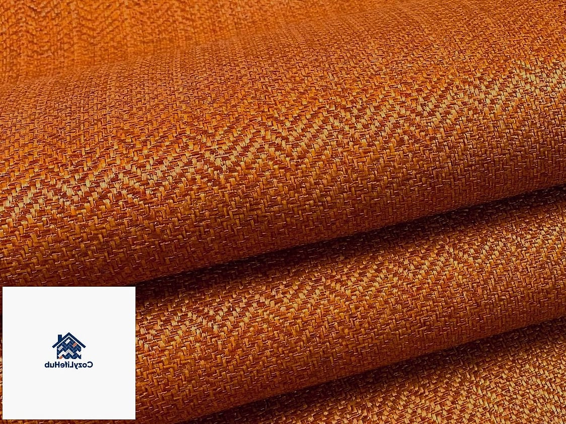
Small kitchens often get stuck with safe, neutral choices out of fear that color will make the space feel cramped. Burnt orange herringbone actually does the opposite here, adding energy and personality that makes a narrow galley kitchen feel intentional rather than overlooked.
The diagonal lines of the herringbone pattern also create a subtle visual lengthening effect along the wall, which helps in tighter footprints.
Stick to a matte finish in small spaces to avoid glare bouncing off multiple close walls, and keep counters simple so the backsplash gets to be the star.
Two-Tone Blue and White Herringbone

Mixing two colors within the same herringbone layout creates a woven, basket-like texture that’s more intricate than a single-color installation. Blue and white is a classic combination that nods to traditional Mediterranean and coastal design without feeling costume-y.
This is a labor-intensive install, so budget for extra installation time or plan on a full day if doing it yourself. The payoff is a backsplash that looks custom-designed rather than picked off a shelf.
Works especially well in kitchens with navy island cabinetry or blue-and-white dinnerware displayed on open shelves.
Coral Pink Herringbone for a Bold Bathroom
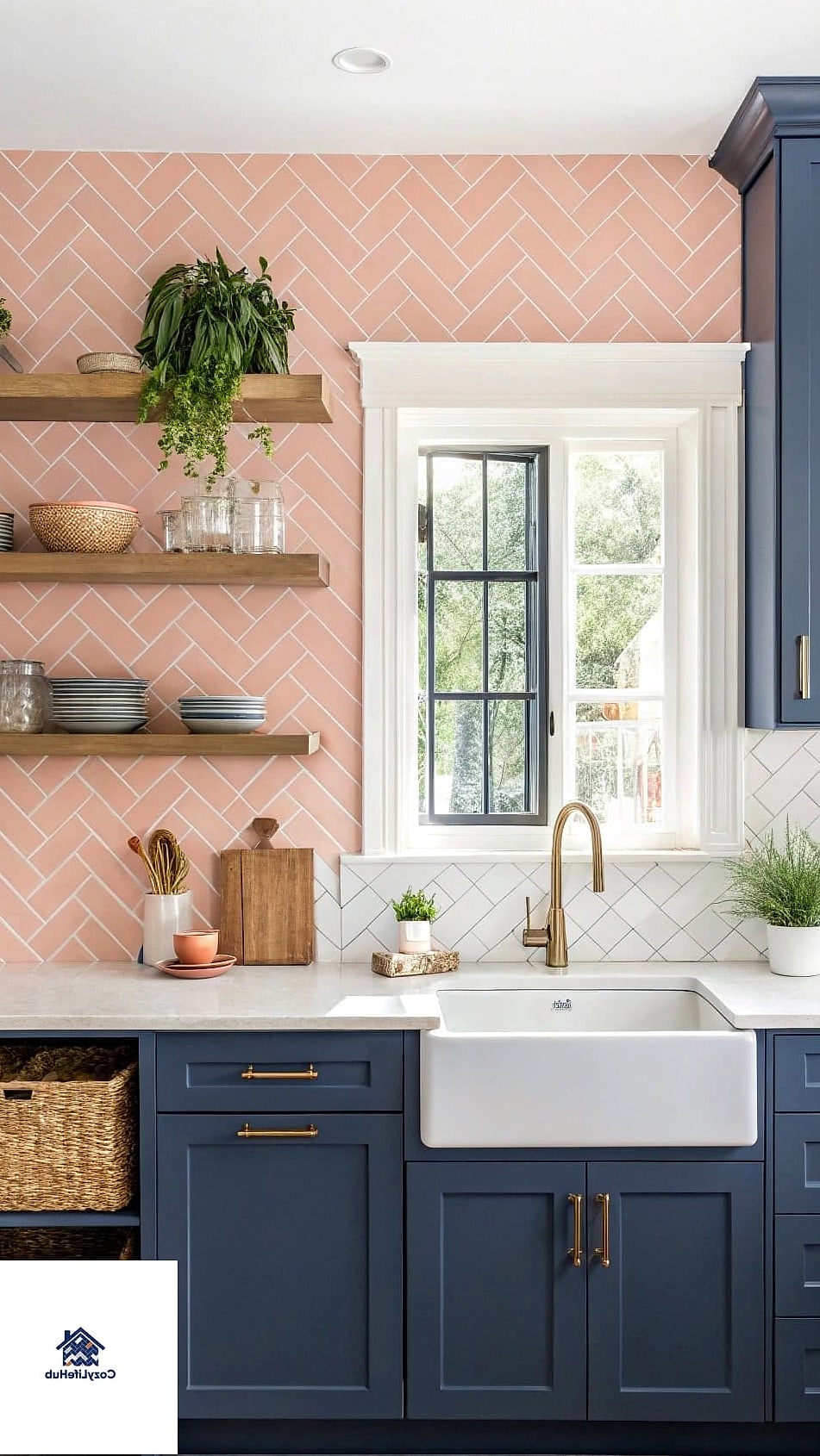
Backsplash ideas don’t have to stop at the kitchen. Coral pink herringbone tile behind a bathroom vanity brings warmth and personality to a room that’s often left stark white.
This color pairs nicely with brushed gold fixtures and a simple white countertop, letting the tile do the heavy lifting. It also photographs well, which matters more than people admit if you’re planning to sell down the road.
Porcelain tile in coral holds up better to humidity and daily splashing than natural stone, and it’s easier to keep looking fresh.
Charcoal and Copper Herringbone
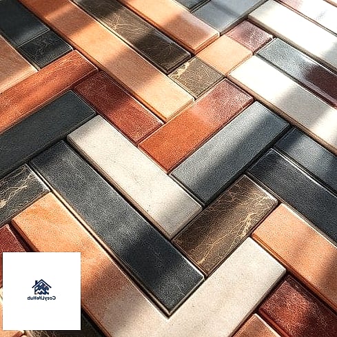
For homeowners who want color without leaning bright or pastel, a charcoal tile with copper-toned grout or accent strips delivers a moody, upscale look. The herringbone pattern adds texture that keeps the dark color from feeling flat or heavy.
This works well in modern or industrial kitchens with black stainless appliances and quartz countertops in a light gray or white.
Because dark grout hides stains well, this combination is genuinely practical for busy households, not just good looking.
Peel-and-Stick Turquoise Herringbone for Renters
Renters shouldn’t have to skip the fun stuff, and turquoise peel-and-stick herringbone tile is one of the easiest ways to add serious color without touching a single wall permanently. Quality has improved a lot in recent years, and many options now have textured, realistic grout lines.
This is ideal for apartment kitchens or as a quick refresh behind a rental bathroom sink. Just make sure the wall underneath is clean and smooth before applying, or the tile won’t adhere properly long-term.
Removal is simple, which means security deposits stay intact.
Rust Red Herringbone with Natural Wood Shelving
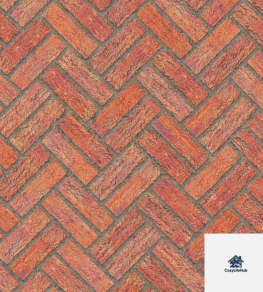
Rust red is a deeper, more grounded cousin of orange, and it pairs incredibly well with natural wood open shelving. The combination feels earthy and collected rather than trendy for trend’s sake.
This works in farmhouse kitchens as well as more modern spaces going for a warm minimalist look. Adding brushed brass hardware ties the wood and tile tones together nicely.
Ceramic tile in this shade is widely available and typically falls into the budget-friendly to mid-range price bracket.
Lavender Herringbone for a Soft, Feminine Kitchen
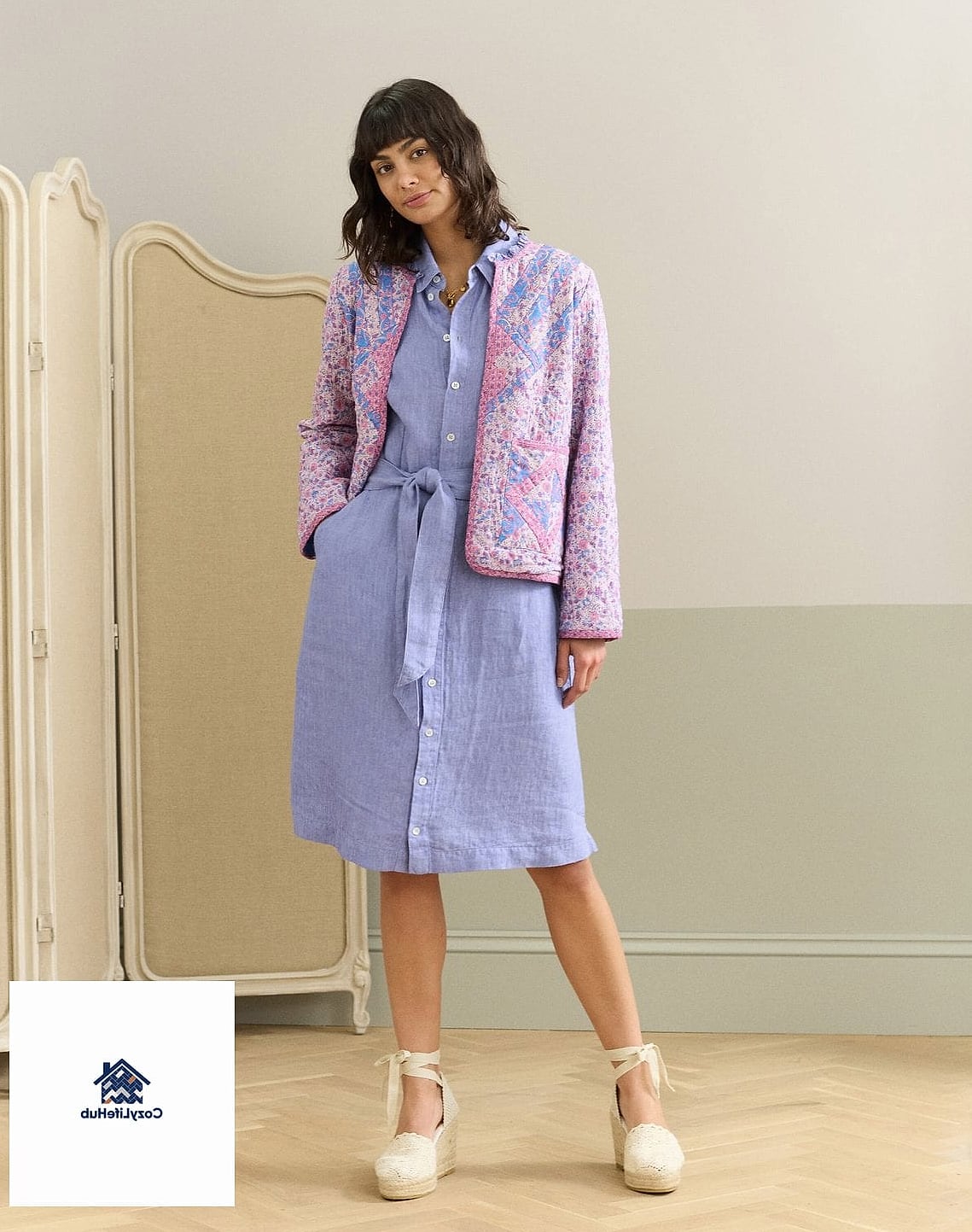
Lavender doesn’t show up often in kitchen design, which is exactly why it stands out when it does. In herringbone, the soft purple tone feels intentional rather than overly sweet.
This pairs surprisingly well with sage green cabinetry or classic white shaker cabinets. It’s a color that photographs beautifully in natural light, making it a strong choice for kitchens with a big window over the sink.
Keep other colors muted in the room so lavender doesn’t end up competing with too many other bold choices.
Navy Blue Herringbone Behind a Range
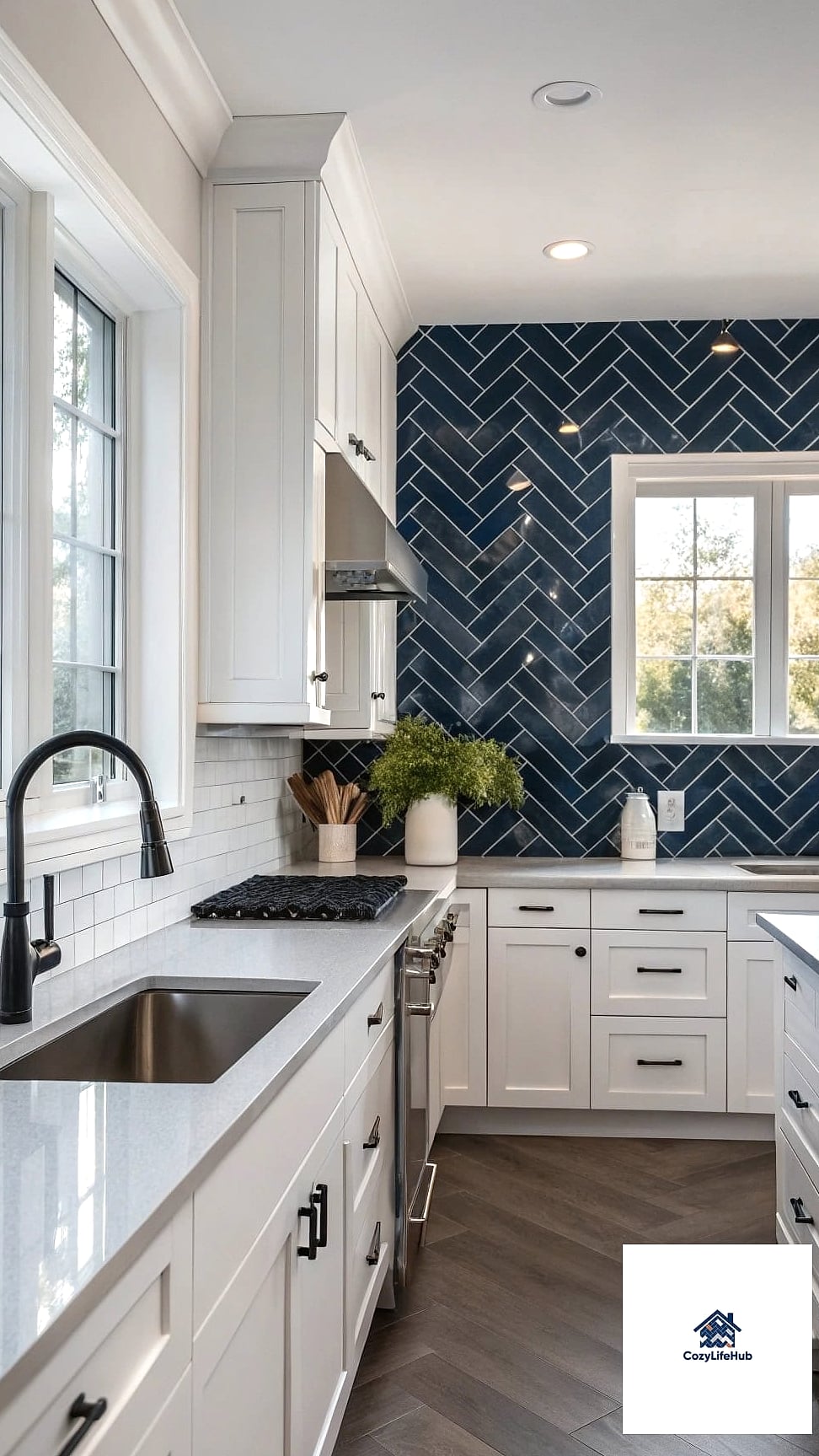
You don’t have to tile an entire wall to get the herringbone effect. A navy blue herringbone accent specifically behind the range or cooktop creates a framed, gallery-like moment that draws the eye exactly where you want it.
This is a great budget option since you’re covering less square footage while still getting maximum visual impact. Pair with a stainless or brass range hood for contrast.
Navy also happens to hide grease splatters better than lighter colors, which is a real practical bonus behind a stove.
Ochre and Cream Herringbone Mix
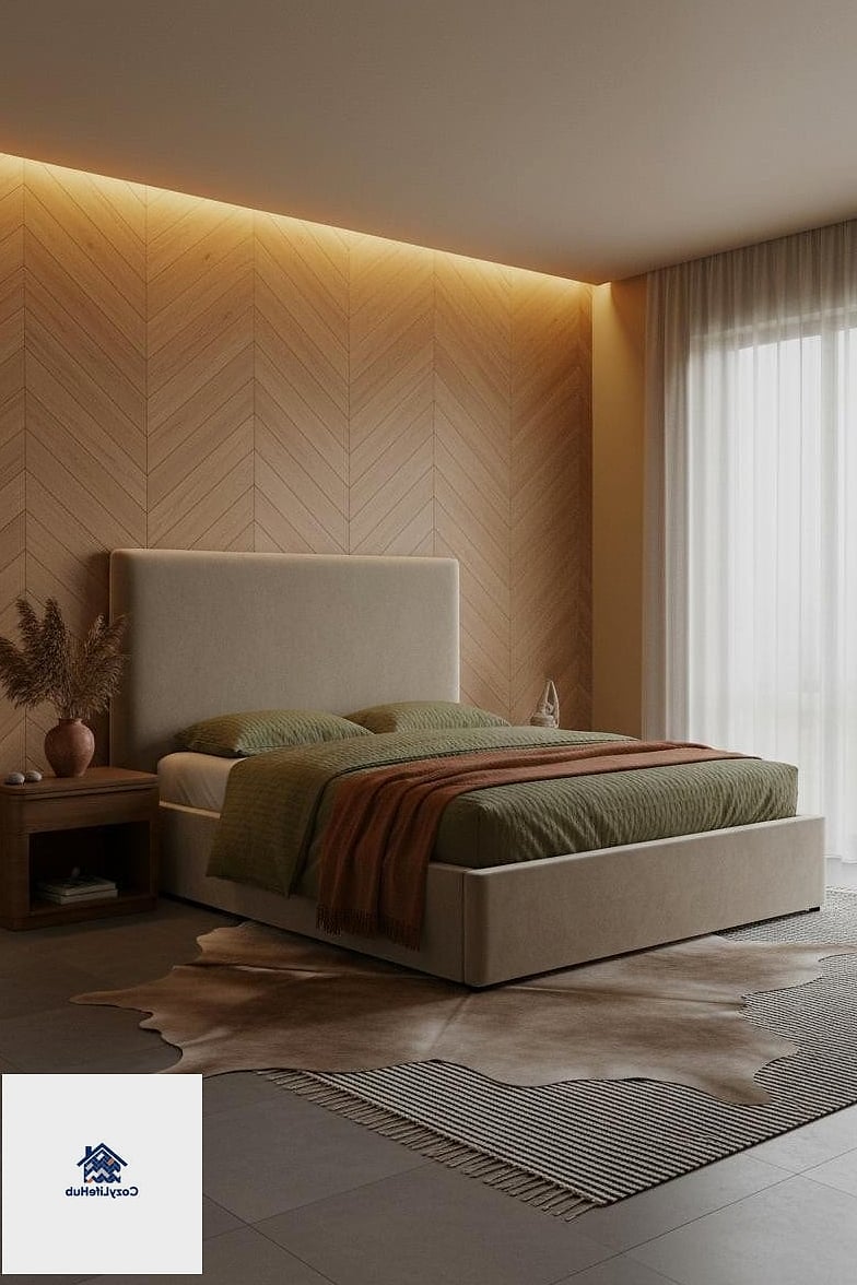
Combining ochre with a soft cream in an alternating herringbone pattern gives a sunbaked, Mediterranean feel that works especially well in kitchens with terracotta floor tile or warm wood cabinetry.
This combination leans more subtle than a single bold color, making it a good middle-ground option for homeowners who want personality without going all-in on saturation.
It’s a flattering choice for kitchens with lots of natural light, since the warm tones amplify that golden-hour glow.
Deep Plum Herringbone for Drama
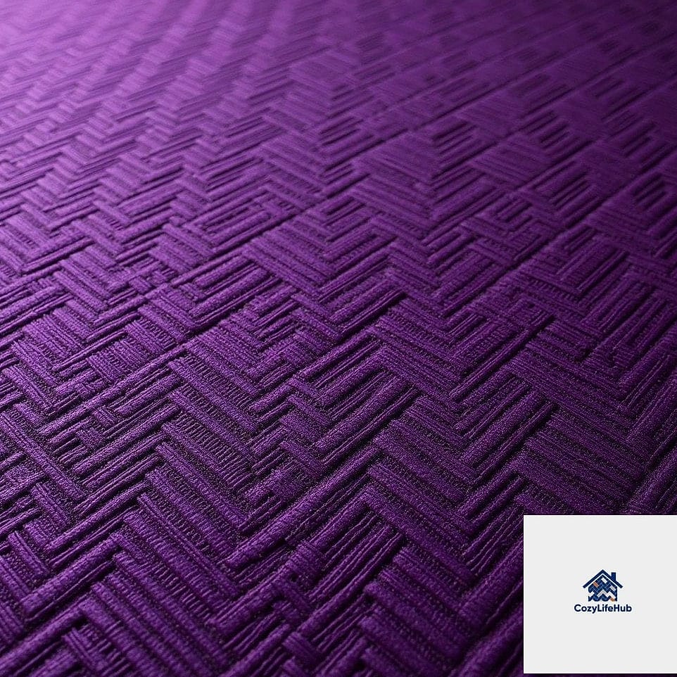
Plum is an underused color in backsplash design, and that’s part of its appeal. Laid in herringbone, it reads as moody, rich, and a little unexpected in the best way.
This pairs beautifully with black or brushed nickel fixtures and pale wood or white cabinetry that lets the plum tone stand out. It’s a strong choice for a kitchen that doubles as an entertaining space, since it photographs beautifully under warm, layered lighting.
Because it’s a darker tone, it also does a good job masking daily wear between deep cleans.
Seafoam Green Herringbone for Coastal Kitchens
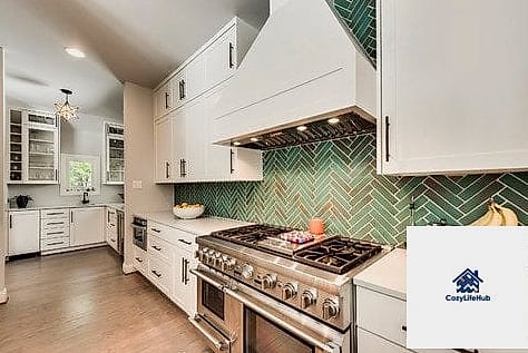
Seafoam sits somewhere between blue and green, giving it a breezy, coastal feel without going full nautical theme. In herringbone, the pattern adds just enough texture to keep the color from feeling flat.
This works well with whitewashed wood cabinetry and woven textures like jute rugs or rattan light fixtures. It’s also a popular choice for beach house kitchens and bathrooms alike.
Glossy finishes amplify the coastal, light-catching effect, while matte keeps things a little more grounded and casual.
Brick Red Herringbone with Black Grout
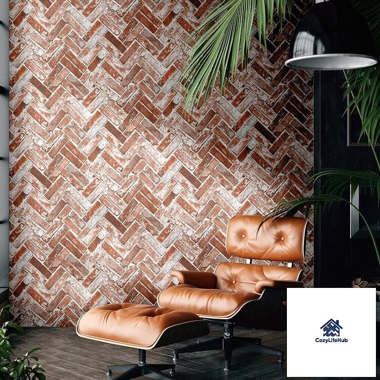
Pairing a warm brick red tile with black grout creates strong contrast that makes the herringbone pattern practically pop off the wall. This is a bolder, more graphic take on color compared to softer pastel options on this list.
Works especially well in industrial-style kitchens or spaces with exposed brick elsewhere in the home, tying the materials together.
Because black grout is naturally stain-resistant, this is a genuinely low-maintenance option for kitchens that see heavy daily use.
Dusty Rose Herringbone for Small Bathrooms
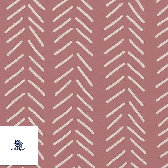
Small bathrooms are the perfect testing ground for a bold backsplash choice, since you’re committing to less square footage overall. Dusty rose herringbone behind a pedestal sink or vanity brings warmth into a room that’s often clinical and cold.
Pair with matte black or brushed brass fixtures depending on whether you want a more modern or more vintage feel. This color also tends to age well, avoiding the overly trendy pitfall some brighter pinks run into.
Because bathrooms deal with humidity, stick to porcelain or ceramic rather than natural stone, which requires more sealing and upkeep.
Olive Green Herringbone with Matte Black Fixtures
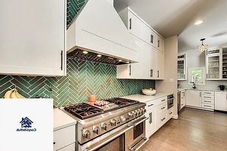
Olive sits between green and brown, giving it an earthy, grounded quality that pairs naturally with matte black hardware and fixtures. In herringbone, it has a quiet richness that doesn’t scream for attention but definitely earns a second look.
This works particularly well in modern farmhouse kitchens or spaces leaning into a moodier, more organic palette. Olive also tends to hide daily grime better than lighter greens, which matters in a high-traffic cooking zone.
Consider pairing with brass accents instead of black for a slightly warmer, softer overall feel.
Multi-Color Herringbone Mosaic

For homeowners who genuinely can’t pick just one color, a multi-tone herringbone mosaic blending three or four complementary shades creates a backsplash that feels like art. Think dusty blue, terracotta, sage, and cream woven together in the same zigzag pattern.
This is a bigger commitment visually, so it works best as the singular bold element in an otherwise simple kitchen with plain cabinetry and neutral countertops. Let the tile be the whole show.
Installation takes patience since color placement needs to be planned out ahead of time, but the result looks genuinely custom and one of a kind.
Whatever color or combination you land on, herringbone tile has a way of making a backsplash feel considered rather than just functional. The pattern brings movement, the color brings personality, and together they turn one of the most overlooked walls in the house into something you’ll actually want to show off. Start with a swatch or a small peel-and-stick sample before committing to a full wall, and let the space guide which of these 21 colorful herringbone backsplash ideas fits best.