10 Dramatic Kitchen Ideas That Designers Keep Coming Back To
- Moody Cabinetry in Deep Charcoal or Black
- A Statement Range Hood
- Full-Height Slab Backsplashes in Natural Stone
- Two-Tone Cabinet Combinations
- Vertical Tile Installations
- Oversized Kitchen Islands With Waterfall Edges
- Open Shelving Styled Like a Display
- Bold Painted Ceilings
- Unlacquered Brass and Mixed Metal Fixtures
- A Dramatic Focal Wall Behind Open Shelving or a Banquette
10 Dramatic Kitchen Ideas That Designers Keep Coming Back To
There’s a difference between a kitchen that’s pretty and a kitchen that stops you in your tracks. Pretty is fine. Pretty is safe. But the kitchens that end up saved on everyone’s inspiration boards usually have something bolder going on underneath the surface.
I’ve talked to enough designers over the years to notice a pattern: certain moves keep showing up in their portfolios, project after project, client after client. These aren’t fleeting trends. They’re the ideas that photograph beautifully, hold up over time, and make people gasp a little when they walk in. Here are ten of them, and why they keep earning their spot in the rotation.
Moody Cabinetry in Deep Charcoal or Black

There’s something about dark cabinetry that reads as confident rather than cold. Charcoal, ink black, or deep forest green cabinets ground a kitchen in a way that white simply can’t.
Designers love this because it works in almost any layout, from a tiny galley kitchen to a sprawling open-concept space. Pair dark lowers with lighter upper cabinets or a pale ceiling to keep the room from feeling like a cave.
Matte finishes tend to look more expensive and hide fingerprints better than glossy ones, which matters if you’ve got kids or a habit of leaning on the counters. Brushed brass or unlacquered brass hardware against black cabinetry is a combination that never seems to go out of style.
A Statement Range Hood
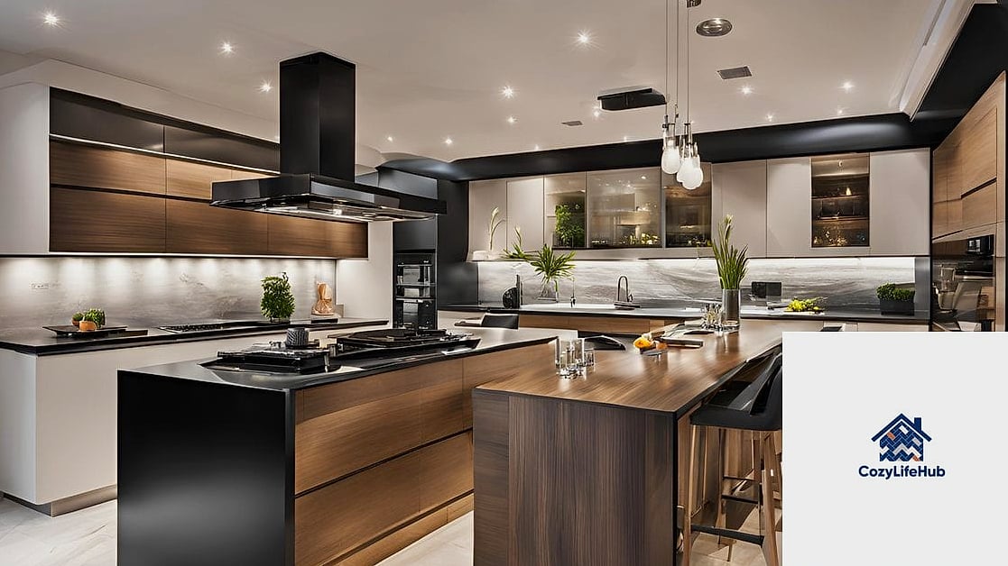
A range hood used to be something you tried to hide. Now it’s often the first thing people notice. Plaster hoods, curved metal hoods, and oversized wood-clad hoods have become the visual anchor of the whole room.
This works especially well in kitchens with vaulted or tall ceilings, since a hood that reaches up toward the ceiling draws the eye and makes the space feel more architectural. Even in standard-height kitchens, a well-proportioned hood adds presence.
If a full custom plaster hood isn’t in the budget, there are prefabricated versions in similar shapes that get you most of the drama for a fraction of the cost.
Full-Height Slab Backsplashes in Natural Stone
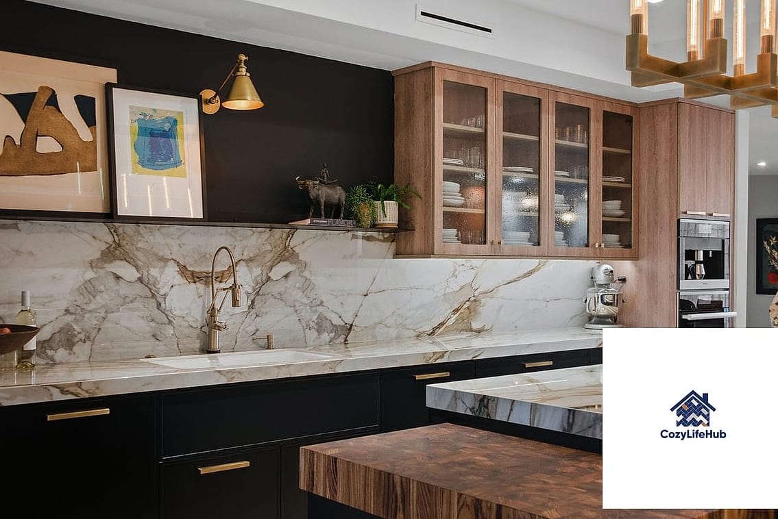
Instead of stopping the backsplash at eighteen inches, designers are running slabs of marble, quartzite, or dramatic-veined stone all the way up to the ceiling behind the range or sink.
It’s a showstopper because the veining becomes part of the room’s art. No grout lines interrupting the pattern, no seams breaking up the visual flow. It reads as intentional and expensive, because it usually is.
This idea works best in kitchens where you want one clear focal wall. Quartzite tends to be more durable and stain-resistant than marble if you’re worried about red wine or lemon juice etching the surface. For a lower-cost version, large-format porcelain slabs mimic the look convincingly and are far more forgiving day to day.
Two-Tone Cabinet Combinations
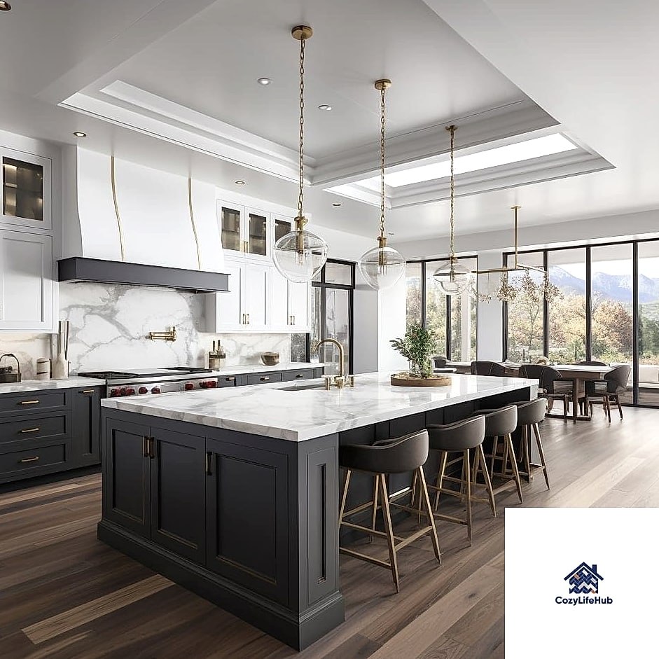
Mixing cabinet colors used to feel risky. Now it’s one of the fastest ways to add depth to a kitchen without going overboard. Think a deep navy island paired with soft white perimeter cabinets, or warm wood tones on the lowers with a creamy white up top.
The island is the obvious place to experiment since it’s already the room’s centerpiece. Designers often use it to introduce a bolder color while keeping the rest of the kitchen calmer, so the space doesn’t feel overwhelming.
This is also a smart move for anyone doing a partial renovation on a budget. Refinishing or repainting just the island is far cheaper than redoing every cabinet in the kitchen, and it still delivers a dramatic before-and-after.
Vertical Tile Installations
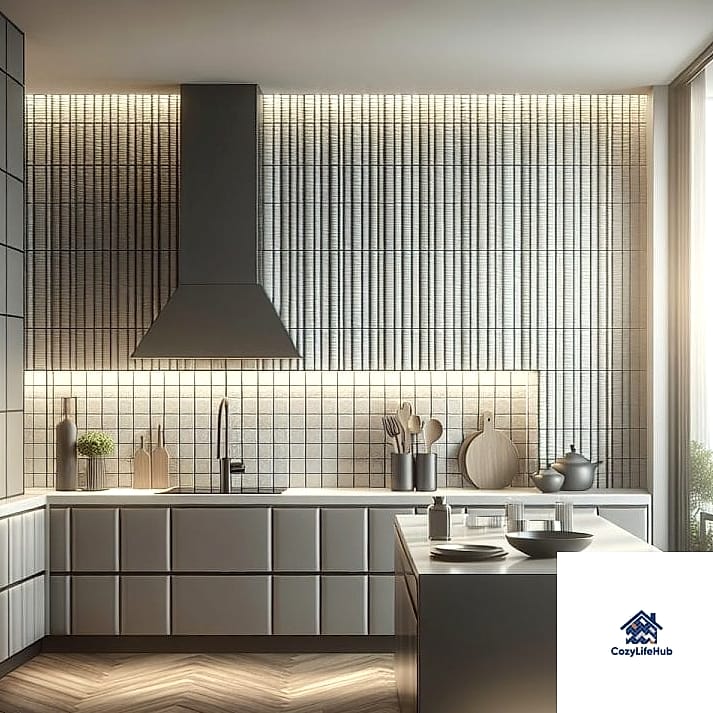
Laying tile vertically instead of horizontally sounds like a small decision, but it completely changes how a room feels. Vertical stacking draws the eye upward, which makes ceilings feel taller and kitchens feel less boxy.
Subway tile, zellige tile, and skinny rectangular tiles all lend themselves well to this treatment. A vertical stack bond backsplash behind the range has become something of a signature look because it’s simple but unexpected.
Zellige in particular has that handmade, slightly imperfect texture that catches light differently across each tile, so even a monochrome vertical wall never looks flat. It’s pricier than standard ceramic and takes a more experienced installer to lay well, but the payoff is worth it for a lot of homeowners.
Oversized Kitchen Islands With Waterfall Edges
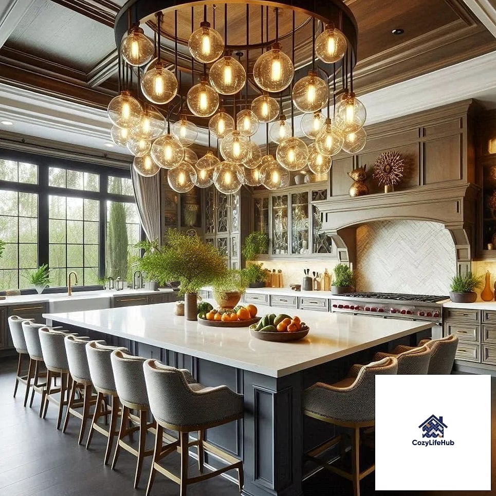
A waterfall island, where the countertop material wraps down the sides to the floor instead of stopping at the edge, has become a defining feature of high-end kitchens. It makes the island look almost sculptural, like a single carved block rather than a piece of furniture with a top.
This works best with materials that have strong veining or movement, like marble or quartzite, since the pattern continues seamlessly down the sides. Quartz is a popular budget-friendly alternative because it’s more consistent and much lower maintenance than natural stone.
Keep in mind waterfall edges do require more square footage of material and more precise fabrication, so it’s not usually the cheapest option. But for the visual impact, designers keep specifying it because clients keep asking for it.
Open Shelving Styled Like a Display
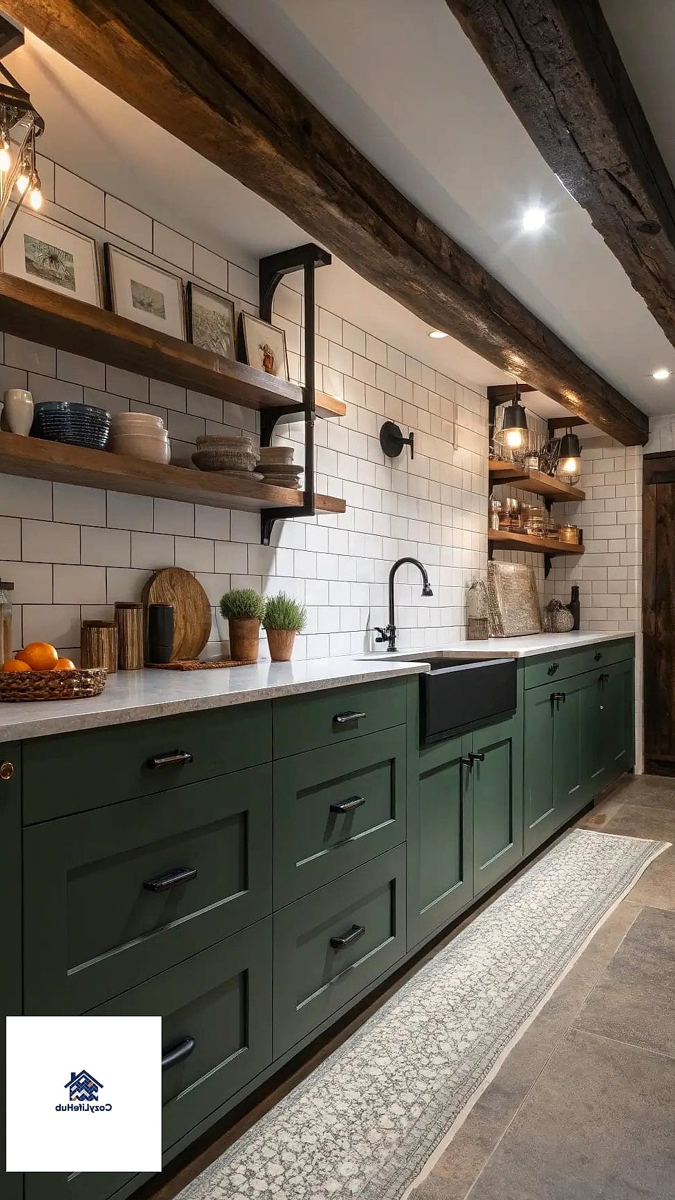
Open shelving gets debated a lot, mostly because it requires more upkeep than closed cabinetry. But when it’s done well, floating wood shelves against a tiled or painted wall can feel more like a curated display than storage.
The trick designers use is restraint. A few well-chosen pieces of pottery, some everyday glassware, a small plant, and negative space in between. Overcrowded open shelves look cluttered fast, so this idea rewards editing.
It’s a great option for renters too, since floating shelves are relatively easy to install and remove without major wall damage. Just know you’ll be dusting more often than someone with closed cabinets, and everything on display needs to earn its spot.
Bold Painted Ceilings
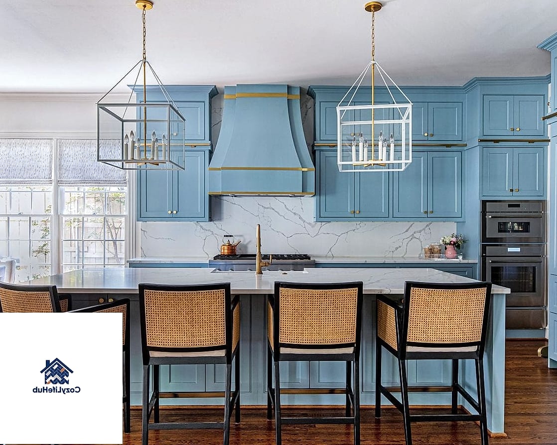
The fifth wall gets ignored constantly, and that’s exactly why painting it makes such an impression. A kitchen ceiling in a deep color, or even a glossy lacquered finish, adds a layer of drama that most people don’t expect to see looking up.
This works particularly well in kitchens with beams, coffered detailing, or interesting architectural lines, since the color emphasizes the shape rather than flattening it. A high-gloss finish bounces light around the room and adds a subtle shimmer that flat paint can’t replicate.
If a full color commitment feels like too much, some designers start with just a painted ceiling in an adjoining breakfast nook or hallway leading into the kitchen, letting the drama build gradually as you walk in.
Unlacquered Brass and Mixed Metal Fixtures
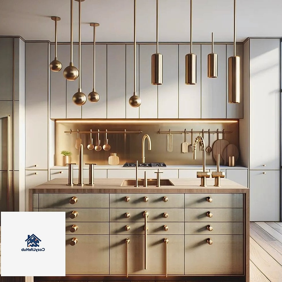
Matching every metal finish in a kitchen used to be the rule. Now designers are mixing warm and cool tones on purpose, and specifically reaching for unlacquered brass because it develops a living patina over time.
Unlacquered brass faucets and cabinet pulls will darken and develop character with use, which some homeowners love and others find alarming until they get used to it. It’s not a low-maintenance choice if you want it to stay shiny, but if you’re drawn to that lived-in, collected-over-time look, it’s hard to replicate with anything else.
Pairing brass hardware with black fixtures or stainless appliances keeps the mix from feeling too matchy, and it’s a detail that photographs beautifully in natural light.
A Dramatic Focal Wall Behind Open Shelving or a Banquette
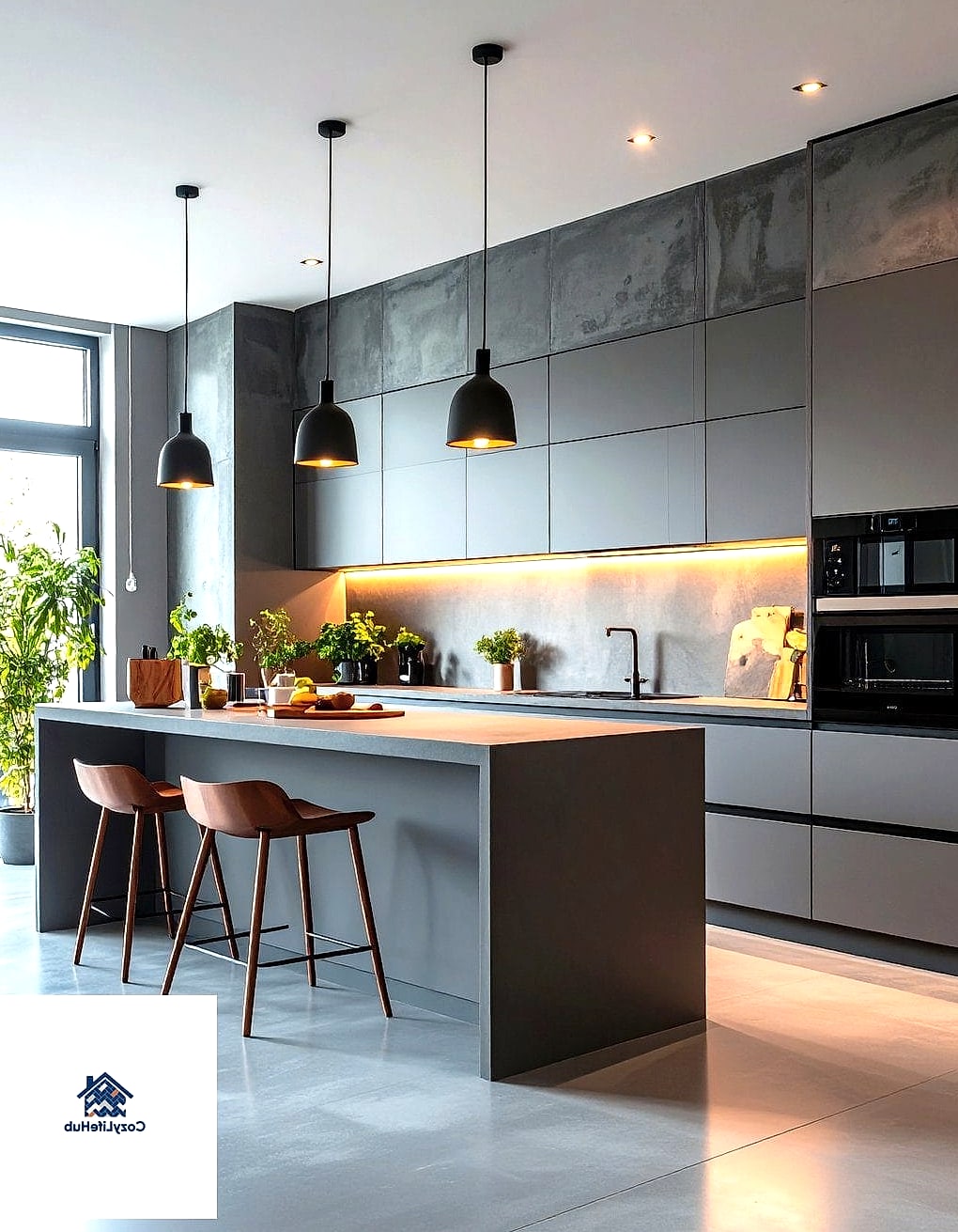
Instead of treating every wall in the kitchen the same, designers are picking one wall, often behind a breakfast nook, banquette, or open shelving unit, and giving it a completely different treatment. That might mean a bold wallpaper, a textured plaster finish, or a contrasting paint color.
This approach lets the rest of the kitchen stay relatively neutral while still delivering a strong visual moment. It’s also more forgiving on the wallet, since you’re only committing to one wall of a potentially expensive material or paper instead of an entire room.
Peel-and-stick wallpaper has gotten remarkably good in recent years, so this is also one of the more renter-friendly ideas on this list if you want the look without a long-term commitment.
Bringing It All Together
What ties all ten of these ideas together is that none of them are about following a trend for the sake of it. Each one adds a specific kind of visual weight, whether that’s color, texture, height, or shine, and gives the eye somewhere interesting to land.
You don’t need to use all ten in a single kitchen, and honestly, you probably shouldn’t. Pick one or two that feel true to your space and your budget, whether that’s a statement hood, a two-tone island, or a bold painted ceiling, and let that be the moment your kitchen is remembered for.
That’s really the throughline behind these 10 dramatic kitchen ideas that designers keep coming back to. They’re not about doing more for the sake of it. They’re about picking the right place to be bold, and letting everything else in the room support that choice.