9 How to Lay Subway Tile Ideas From Homes We Absolutely Love
- Classic Running Bond (But Make It Bigger)
- Vertical Stack for a Taller Ceiling Feel
- Herringbone for Serious Visual Interest
- Horizontal Stack With No Offset
- Herringbone Meets Vertical for Extra Drama
- Grid Pattern With Bold Grout Color
- Diagonal Layout for Small Bathrooms
- Mixed Layout With a Herringbone Accent Strip
- Extended Grout Joint for a Modern Minimalist Look
9 How to Lay Subway Tile Ideas From Homes We Absolutely Love
Subway tile gets a bad reputation for being boring, but honestly? That’s only true if you install it the same way everyone else does. The classic brick-lay pattern is great, but there are so many other ways to lay this humble little tile that completely change the look of a room. I’ve been pulling inspiration from real homes lately, and the layout alone is doing more design work than the tile color half the time.
If you’re planning a kitchen backsplash, a bathroom shower surround, or even a laundry room accent wall, the way you lay your subway tile matters just as much as the tile itself. Here are nine layouts from homes that made me stop scrolling and actually take notes.
Classic Running Bond (But Make It Bigger)
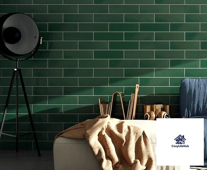
The traditional brick-lay pattern isn’t going anywhere, and honestly, there’s a reason it’s stuck around for over a century. Each tile is offset by half the length of the one below it, creating that timeless, staggered look you see in old subway stations.
What’s changed is the scale. Homeowners are swapping the standard 3×6 tile for larger formats like 4×8 or even 4×12, which means fewer grout lines and a cleaner, more modern feel. It’s still that familiar pattern, just stretched out and simplified.
This works beautifully in kitchens with white or off-white tile and a soft gray grout for subtle contrast. It’s also one of the easiest layouts for a DIY project since the offset is forgiving and doesn’t require much planning ahead. If you’re tiling your first backsplash, this is a low-stress place to start.
Vertical Stack for a Taller Ceiling Feel
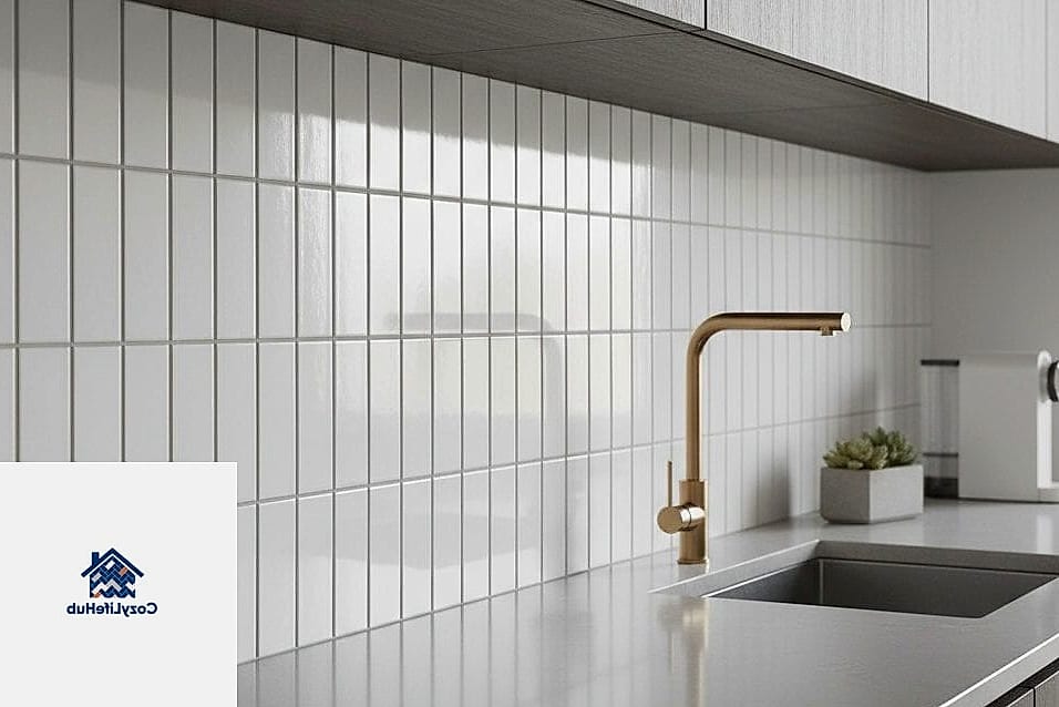
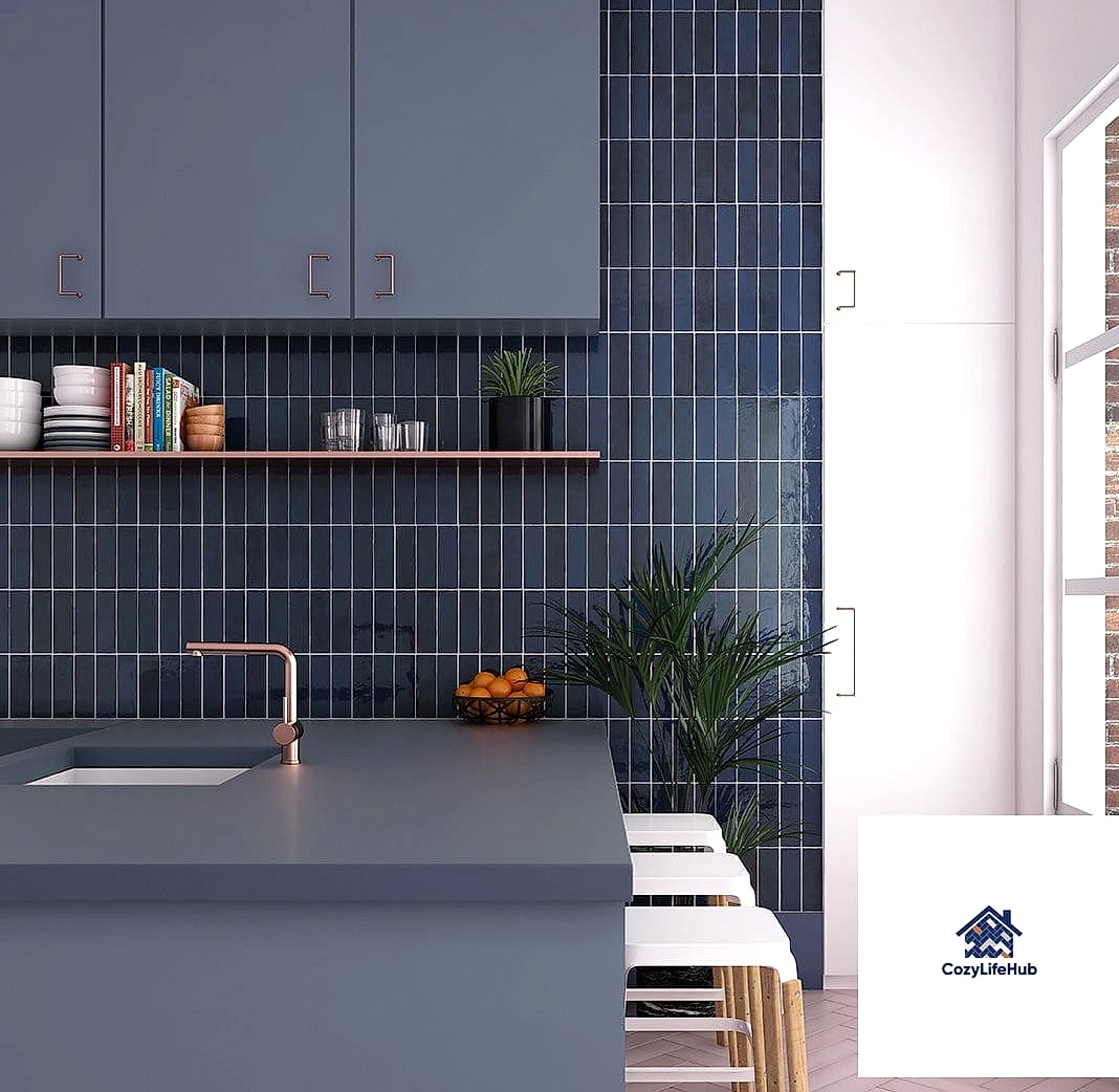
Instead of running tiles horizontally, some homeowners are turning them on their side and stacking them straight up. It’s a small shift that makes a surprisingly big visual difference, especially in rooms with lower ceilings.
Vertical installation draws the eye upward, which tricks the brain into thinking the space is taller than it actually is. I’ve seen this done beautifully behind a range hood, where the vertical lines lead straight up to the hood and create a natural focal point.
It pairs well with brushed brass hardware and warm wood tones, giving the kitchen a slightly more elevated, custom-built look. The tricky part is keeping your grout lines straight since any waviness is more noticeable when tiles run vertically, so this one’s a bit less forgiving for a first-time DIYer.
Herringbone for Serious Visual Interest
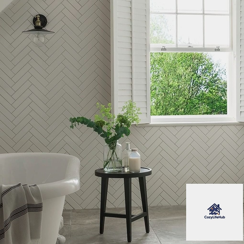
If you want subway tile to feel like a statement instead of a background detail, herringbone is the move. Tiles are laid at 45 or 90-degree angles to form a zigzag pattern that adds texture and movement to an otherwise flat surface.
This layout takes more time and more tile since there’s more cutting involved, but the payoff is huge. It’s become a favorite for shower walls and kitchen backsplashes where homeowners want something that feels custom without going full mosaic.
Herringbone looks especially good in matte finishes, which soften the busyness of the pattern a little. Pair it with a neutral color palette and it reads as elevated rather than chaotic. This is one layout I’d recommend hiring a pro for unless you’ve tiled before, because the angle cuts need to be precise.
Horizontal Stack With No Offset
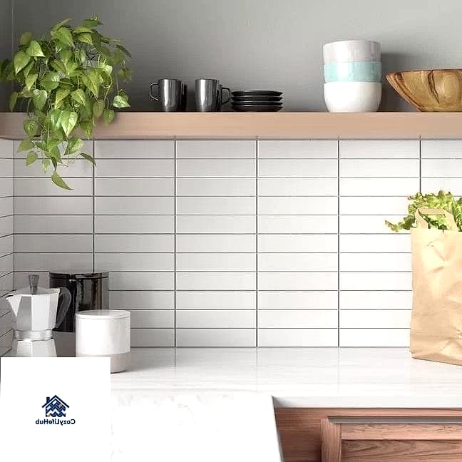
This one feels almost architectural. Instead of staggering the tiles, you line them up directly on top of each other, creating clean horizontal rows and perfectly aligned vertical grout lines.
It’s a minimalist’s dream layout. The grid-like grout pattern gives the wall a structured, almost tile-mosaic feel, especially when paired with a contrasting grout color. I’ve seen this done in laundry rooms and mudrooms where the goal was a slightly more graphic, modern look.
Stacked layouts do require more precise tile cutting since there’s no offset to hide uneven edges, so it’s worth double-checking your wall is level before you start. When it’s done right, though, it looks incredibly intentional and clean.
Herringbone Meets Vertical for Extra Drama
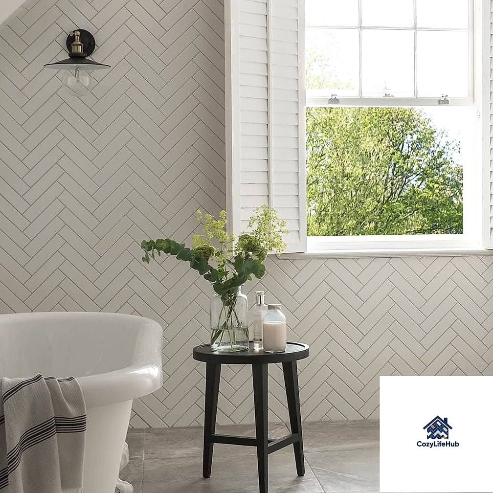
Some homes are combining two trends at once by laying herringbone tile vertically instead of the usual horizontal orientation. The zigzag pattern still happens, but the overall direction pulls upward instead of across.
This is a great option for a small powder room or a narrow shower niche where you want maximum visual impact in a compact space. It draws the eye up and makes the room feel less boxy.
Because this layout involves more angled cuts, it’s not the most beginner-friendly project, and tile waste tends to run higher too. If you’re working with a tile installer, ask them to dry-lay a section first so you can see how the pattern falls before committing.
Grid Pattern With Bold Grout Color
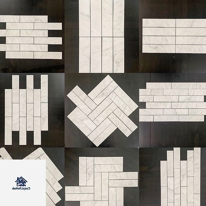
Stacking subway tile in a straight grid is nothing new, but pairing it with a bold or contrasting grout color is what’s making this layout feel fresh again. Think black grout against white tile, or a deep charcoal against a soft cream.
The grout basically becomes part of the design instead of disappearing into the background. It highlights the geometry of the grid pattern and gives the whole wall a graphic, almost tiled-floor-on-a-wall kind of energy.
This works especially well in kitchens leaning into a slightly more industrial or modern farmhouse look. Just know that darker grout, while dramatic, does show soap scum and water spots a bit more in wet areas like showers, so keep a grout brush handy for upkeep.
Diagonal Layout for Small Bathrooms
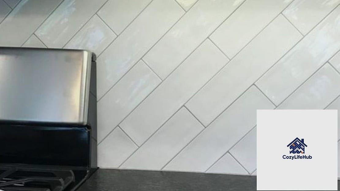
Turning your subway tile 45 degrees so it runs diagonally across the wall is a layout that doesn’t get talked about enough. It adds movement and can make a small bathroom or shower stall feel less cramped.
Diagonal tile creates longer sightlines across the wall, which is the same trick used with diagonal flooring to make small rooms feel more spacious. It’s a subtle effect, but it’s noticeable once you see it in person.
This layout does require more cutting along the edges of the wall, which means more waste and a slightly higher material cost. It’s worth budgeting an extra 10 to 15 percent more tile than you think you’ll need when planning a diagonal installation.
Mixed Layout With a Herringbone Accent Strip
Instead of committing to one pattern for the entire wall, some homeowners are mixing layouts, using a classic running bond for most of the space and a herringbone strip as an accent border or backsplash detail behind the stove.
This gives you the best of both worlds. You get the simplicity and lower cost of a standard layout for the bulk of the tile, plus a little extra personality where it counts most. It’s a smart middle ground if you love herringbone but don’t want to tile an entire shower in it.
I’ve also seen this done with a herringbone inset centered above a range as a kind of built-in focal point, almost like a piece of art. It’s a great way to add custom character on a budget-friendly plan.
Extended Grout Joint for a Modern Minimalist Look
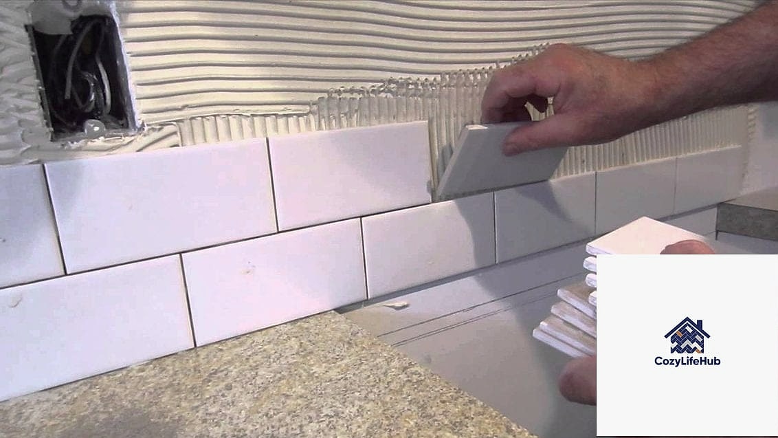
This layout keeps the classic running bond pattern but widens the grout joints slightly beyond the standard 1/16 to 1/8 inch spacing. The wider lines give the tile a more relaxed, slightly imperfect look that leans into the current appetite for a less polished, more organic aesthetic.
It pairs especially well with slightly irregular or handmade-look subway tile, which has more texture and subtle color variation than a perfectly uniform ceramic tile. The wider grout lines let that texture actually show instead of getting lost.
This is a nice option if you like the idea of zellige tile but want something more budget-friendly and easier to install. Regular subway tile with generous grout spacing gets you close to that same handcrafted feel without the higher price tag or the trickier installation process that comes with actual zellige.
Whichever layout catches your eye, the good news is that subway tile is genuinely one of the more forgiving materials to work with, especially compared to natural stone or intricate mosaic patterns. Start with a dry layout on the floor before you mix any mortar, so you can see exactly how your chosen pattern will look and make adjustments before it’s permanent. Small layout decisions like these really do add up to a space that feels thoughtfully designed rather than just tiled.