16 Farmhouse Backsplash Ideas That Look Expensive But Aren’t
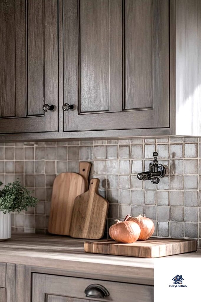
- Classic White Subway Tile in a Brick Pattern
- Zellige-Inspired Ceramic Tile
- Vertical Herringbone in Neutral Tones
- Beadboard Backsplash with a Painted Finish
- Handpainted-Look Mosaic Tile
- Shiplap Above a Simple Tile Base
- Large Format Porcelain Slab Tile
- Stacked Subway Tile for a Cleaner Look
- Basketweave Tile in Soft Neutrals
- Reclaimed Wood Look Tile
- Peel-and-Stick Subway Tile for Renters
- Fluted or Ribbed Tile Accent
- Checkerboard Tile in Muted Colors
- Natural Stone Pebble Accent Strip
- Two-Tone Tile with a Contrast Border
- Textured Ceramic Tile in Warm Earth Tones
16 Farmhouse Backsplash Ideas That Look Expensive But Aren’t
Farmhouse style has this reputation for being warm and inviting, but the backsplash is really where you can make it feel custom without spending like you hired a designer. A lot of the priciest-looking kitchens I’ve seen actually used pretty affordable tile, just installed thoughtfully. Below are 16 ideas that give you that collected, high-end farmhouse look without the high-end price tag.
Classic White Subway Tile in a Brick Pattern
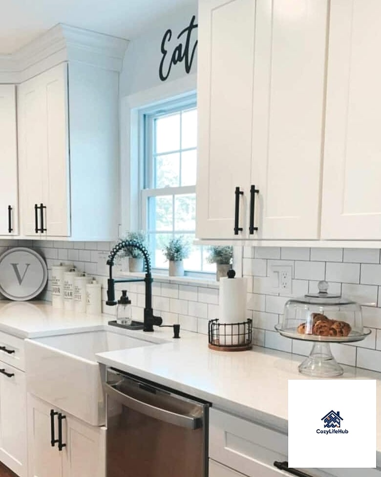
This one’s a farmhouse staple for a reason. The offset brick layout has that lived-in, old-cottage charm, and white subway tile is one of the cheapest tiles you can buy per square foot. Pair it with a warm white grout instead of stark white and it instantly looks softer and more intentional. It works in kitchens of any size, and it’s forgiving if your walls aren’t perfectly straight, which happens more than people admit in older farmhouse-style homes.
Zellige-Inspired Ceramic Tile
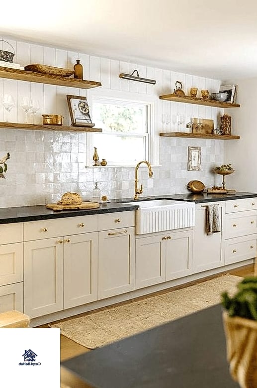
Real Moroccan zellige tile runs expensive fast, but there are ceramic and porcelain versions now that mimic the handmade, slightly wavy texture for a fraction of the cost. You still get that light-catching, artisanal look that makes a backsplash feel like a design statement. I’d use it behind a range as a focal point rather than covering the whole wall, since it reads as more special in smaller doses.
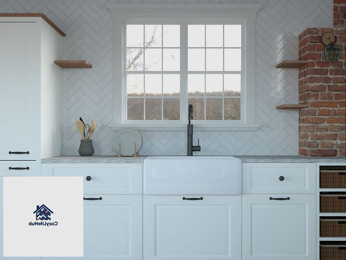
Vertical Herringbone in Neutral Tones
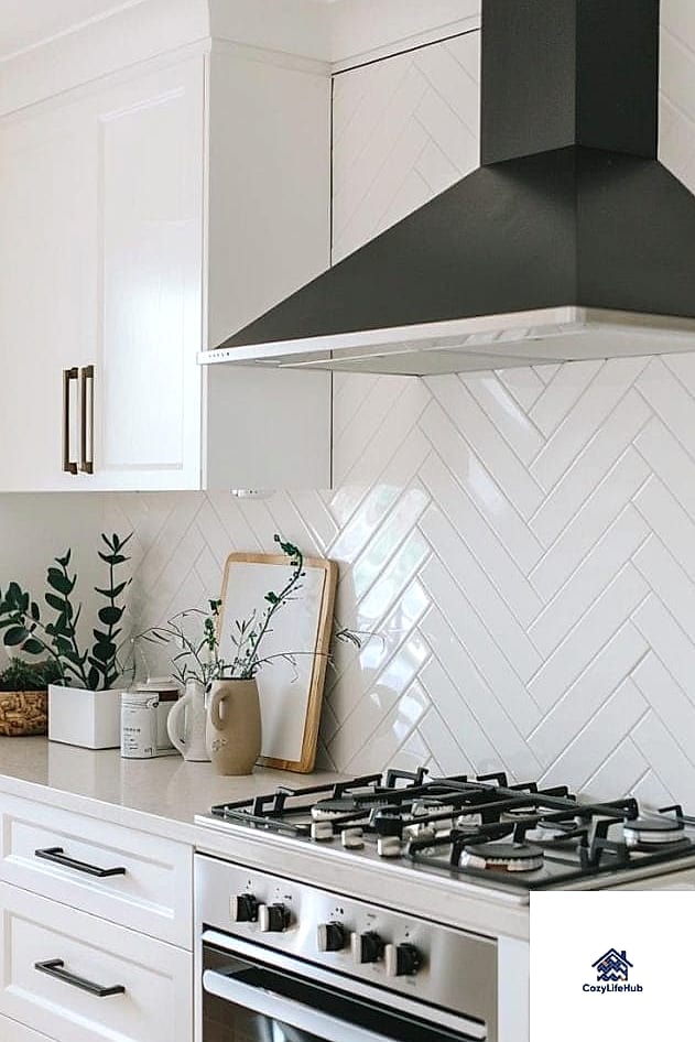
Herringbone automatically looks more expensive just because of the installation pattern, even when the tile itself is basic. Running it vertically instead of the usual diagonal adds height and makes ceilings feel taller, which is a nice trick in older farmhouse kitchens with lower ceilings. Stick to a neutral palette like cream, taupe, or soft gray so it doesn’t compete with wood cabinetry.
Beadboard Backsplash with a Painted Finish
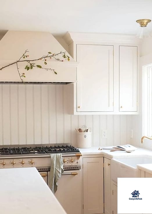
Not every backsplash idea has to involve tile. Beadboard paneling, painted in a soft white or sage green, gives that cottage farmhouse feel and costs noticeably less than most tile installations. It’s a doable weekend DIY project for most homeowners, and it pairs beautifully with butcher block countertops. Just seal it well since it sits near water and cooking splatter.
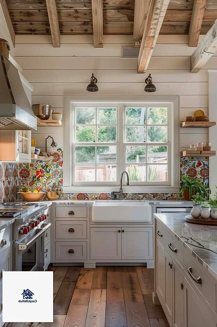
Handpainted-Look Mosaic Tile
Mosaic tiles that mimic hand-painted patterns, think small floral motifs or subtle geometric shapes, add personality without turning the whole kitchen into a busy pattern-fest. Use them as an accent strip above the stove or sink rather than the entire backsplash. This keeps costs down since you’re only buying a small quantity of the pricier tile and filling the rest with plain subway or ceramic.
Shiplap Above a Simple Tile Base
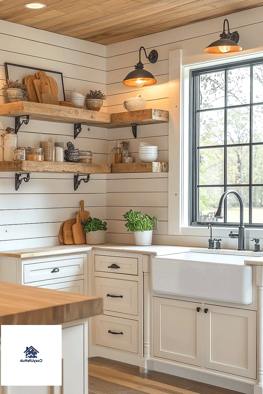
Shiplap has become almost synonymous with farmhouse style at this point, but it still works because it adds texture that plain drywall can’t. Running shiplap on the upper portion of the wall and a simple tile like ceramic subway on the lower splash zone gives you two textures for less money than an all-tile wall. It’s especially nice in kitchens with open shelving since the wood grain shows through behind the dishes.
Large Format Porcelain Slab Tile
Large slab tile looks like natural stone or marble but comes in porcelain, which is far more budget-friendly and much easier to keep clean. Fewer grout lines means less scrubbing, which matters if you’re not into constant maintenance. This is a good pick for anyone who wants a farmhouse kitchen that still feels a little modern and streamlined.
Stacked Subway Tile for a Cleaner Look
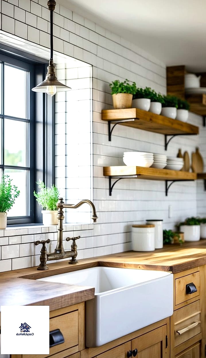
If brick-pattern subway tile feels too busy for your taste, try stacking the same tiles in a straight grid instead. It reads as more contemporary farmhouse, sometimes called modern farmhouse, and it’s honestly easier to install since you’re not staggering each row. The clean lines pair really well with black or brushed brass hardware on the cabinets.
Basketweave Tile in Soft Neutrals
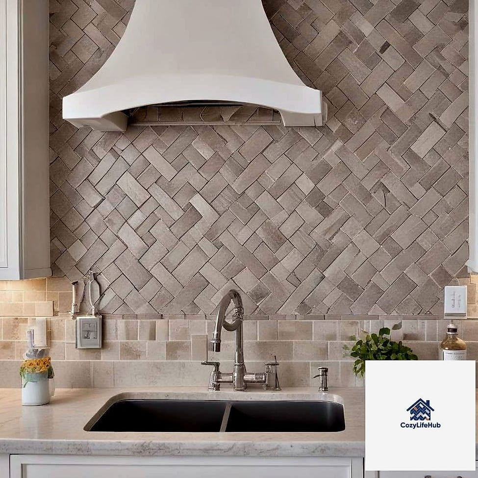
Basketweave patterns have that vintage, old-world texture that feels expensive because of the visual complexity, even though the individual tiles are usually small and inexpensive ceramic pieces. Keep the color palette to one or two neutral tones so it doesn’t overwhelm the space. It works particularly well in a farmhouse kitchen with a apron-front sink as the centerpiece.
Reclaimed Wood Look Tile
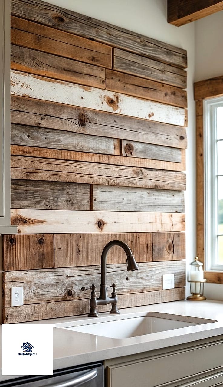
Wood-look tile has come a long way, and it gives you that rustic reclaimed wood aesthetic without worrying about water damage or warping near your sink. It’s a great option for anyone who loves the farmhouse look but doesn’t want to deal with sealing actual wood. Lay it in a horizontal plank pattern for a barn-inspired feel that still functions like normal tile.
Peel-and-Stick Subway Tile for Renters
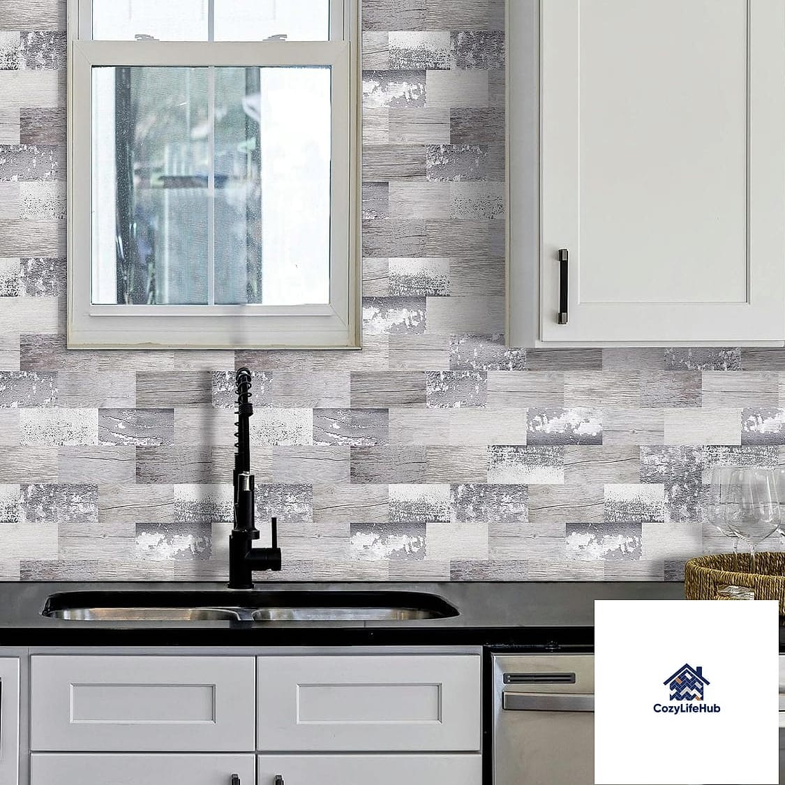
If you’re renting or just not ready to commit to a full tile job, peel-and-stick subway tile designs have gotten surprisingly convincing. They’re renter-friendly, removable, and cost a fraction of real tile installation. It’s not going to hold up quite as long as the real thing, but for a temporary refresh it gives you nearly the same visual payoff.
Fluted or Ribbed Tile Accent
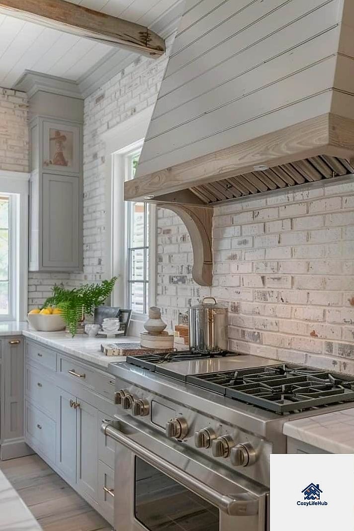
Fluted tile adds dimension and shadow play that flat tile just can’t match, and it’s having a moment in farmhouse-meets-modern kitchens. Using it as a small accent, like a niche behind open shelves or a strip above the stove, keeps the cost reasonable while still giving you that textured, expensive-looking detail. It photographs beautifully too, if that matters to you for resale or just your own enjoyment.
Checkerboard Tile in Muted Colors
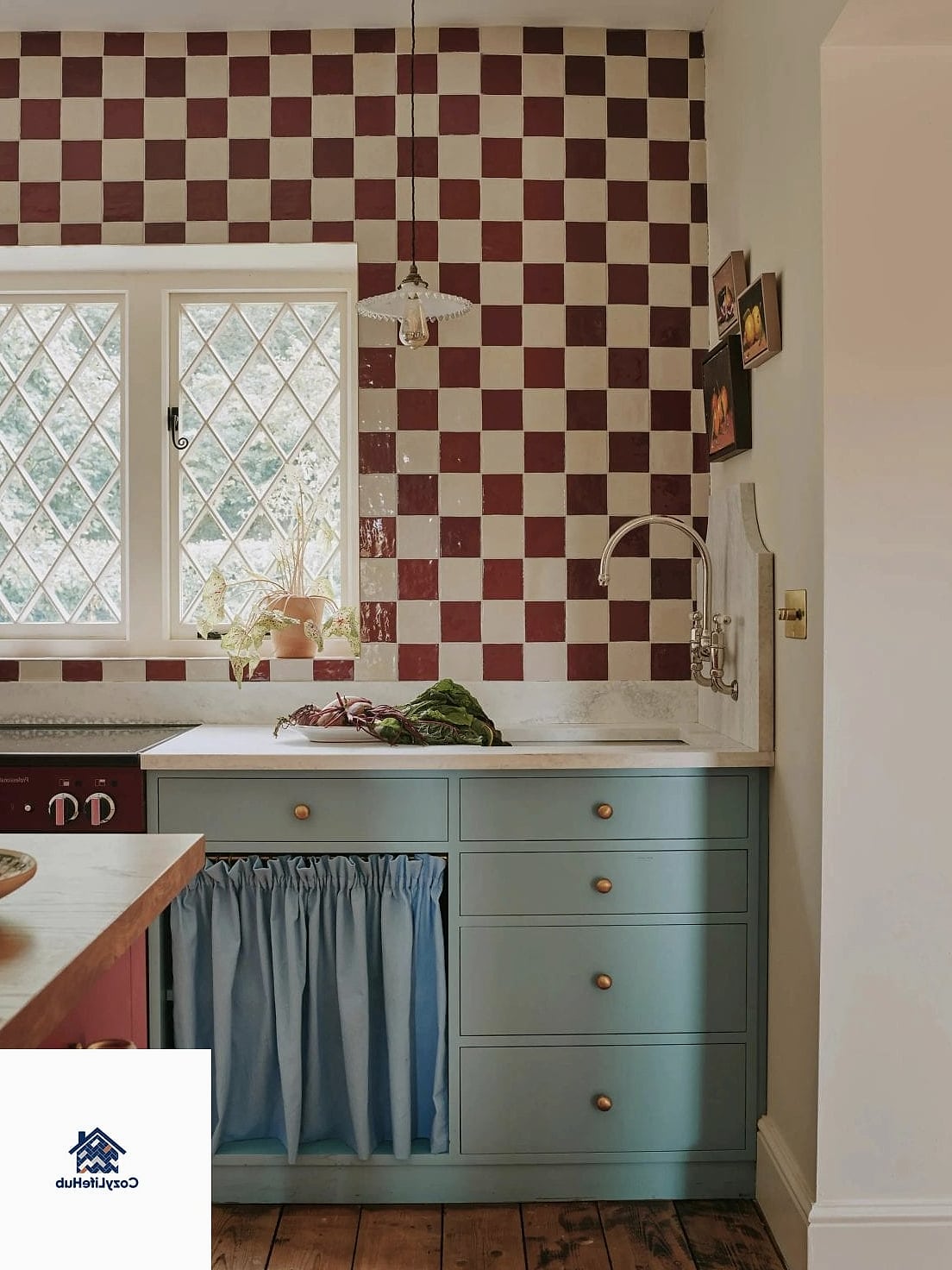
A checkerboard pattern feels playful but still classic when you use muted, farmhouse-appropriate colors like cream and soft charcoal instead of stark black and white. It works especially well in a smaller kitchen or a butler’s pantry where you want a little more personality. Ceramic tile keeps this affordable, and the pattern itself does most of the visual heavy lifting.
Natural Stone Pebble Accent Strip
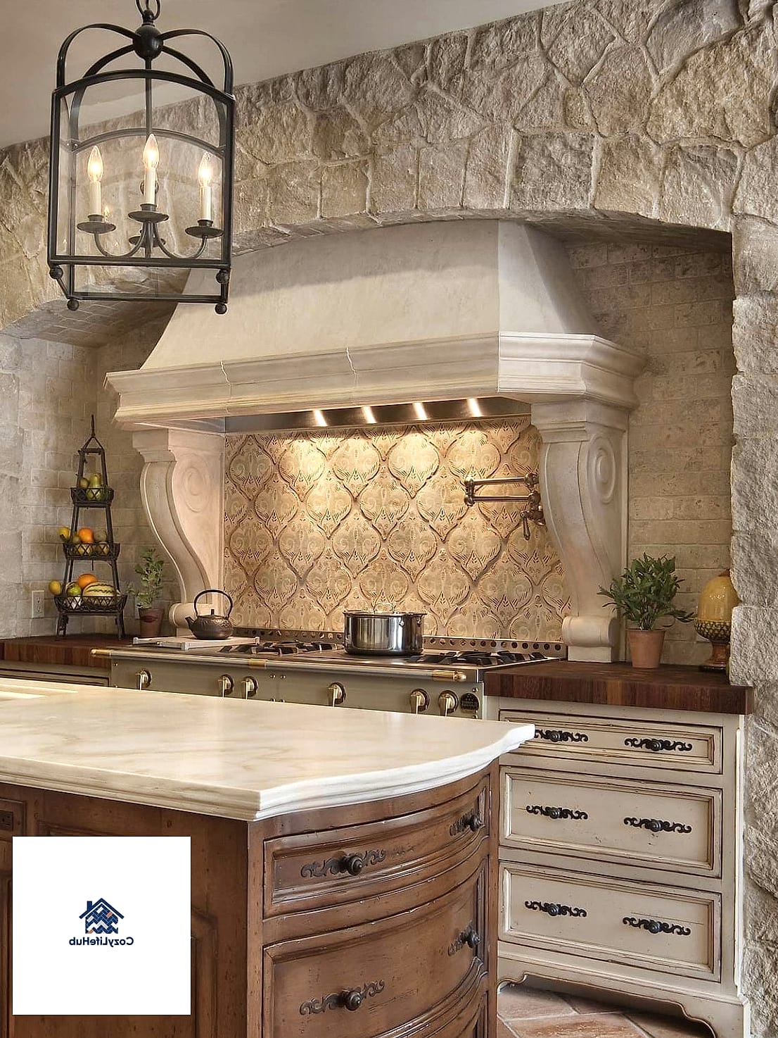
A thin strip of natural stone or pebble tile above the stove adds texture and an organic, earthy feel that fits right into farmhouse style. Because you’re only using it as an accent rather than covering the whole wall, the material cost stays manageable even though stone tends to run pricier per square foot. It also hides minor grease splatter better than smooth glossy tile.
Two-Tone Tile with a Contrast Border
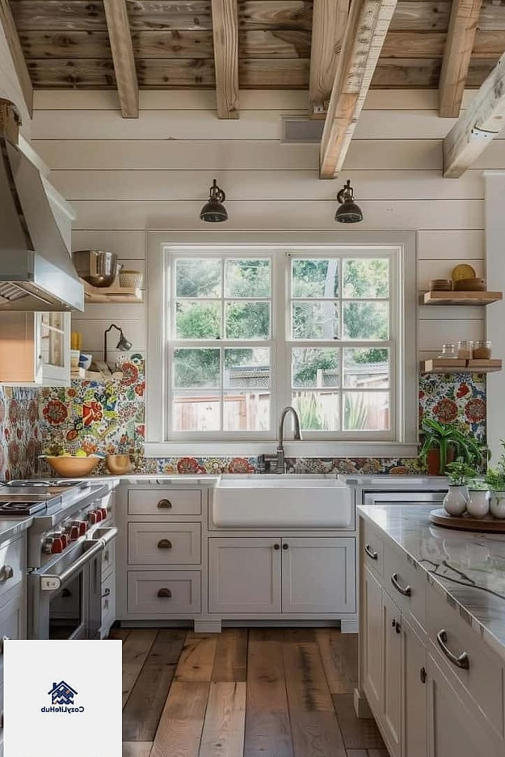
Framing a simple field tile with a contrasting border tile, like white subway with a thin black or navy trim, gives the whole backsplash a finished, tailored look. It’s a small design move that a lot of higher-end kitchens use, and it barely adds to your material cost since the border is usually a small quantity. This works nicely if your farmhouse kitchen already has some black fixtures or hardware to tie into.
Textured Ceramic Tile in Warm Earth Tones
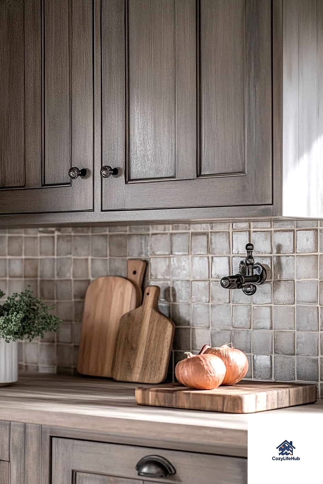
Instead of white or gray, try a warm terracotta, ochre, or clay-toned ceramic tile with a slightly textured, matte finish. It brings warmth into the kitchen and pairs surprisingly well with farmhouse staples like open shelving, wood cutting boards, and greenery on the counter. This is a great option if your kitchen gets a lot of natural light, since the texture catches shadows throughout the day.
Putting together a farmhouse backsplash that looks custom doesn’t really come down to spending more, it comes down to choosing a pattern or texture that does the visual work for you. Subway tile, basic ceramic, and even peel-and-stick options can all look expensive when the layout and grout color are considered carefully. My honest advice is to pick one or two of these ideas that fit your kitchen’s lighting and cabinet color, rather than trying to combine too many patterns at once. A backsplash is one of those details people notice immediately, so it’s worth taking your time picking the one that actually feels like you.